This is continuation of the previous article. In this article, we will see another way of creating Histogram using Pivot Table.

Download this sample file and follow along. The data is exactly the same as the previous article. But the method of creating the histogram is different.
Using Pivot Table
The data is already an Excel Table. Create a Pivot Table.
Put Qty Sold column in Row area as well as Data area.

It will show all unique quantities and their totals.

Not very useful right now because there are too many rows.
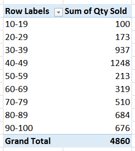
Right click in the row area and choose Group … and choose Group By value as 10.

Now it shows bins separated by 10 and their sums. Right click in the data area and choose Summarize Values By – choose Count (because we are counting how many fell in each bin). This is the frequency distribution across bins.

![image[12] image[12]](https://5ecacaf0.delivery.rocketcdn.me/wp-content/uploads/2015/10/image1210.png)
Now draw a Pivot Chart of Column type. Reduce the gap width to zero and add a border. And we now have a Histogram!

Benefits over Data Analysis ToolPak
Both look the same. But Pivot Table is extremely flexible. It offers many other things which the data analysis add-in is simply not capable of.
Change the bin size
Right click in Row area, choose Group … and change the BY value from 10 to anything else. It will instantly change the data summary as well as the chart. Trying different bin sizes may be useful to find the most suitable one for your data.
Instead of Count use other summary options
Although traditionally histogram is supposed to give frequency (count) distribution, viewing Sum or Average for each bin is equally useful. Try all options in Show Values As to get more useful information about the data.
Filtering on other fields or time
In this case, the data has only one column called Qty Sold. However, in real life you will have more columns. These columns could contain dates, locations, customer details, product details and so on. Filtering data on these parameters will allow you to explore business patterns which are hidden inside the data and this may lead to better decisions and actions.
Use other types of charts
Do not be limited by the traditional histogram format. Try Recommended Charts with your data to view it in different ways. Viewing the same data differently will give you additional useful information.
Try dissimilar bins
This will not give you frequency distribution but it can give you different kind of useful information. Grouping feature of Pivot Table does not allow dissimilar grouping bins. You must use Vlookup approach to manage bin analysis using custom bins.
The quality of the quality management process itself can be increased
Enjoy!


