
Convert rows to columns using Power Query – Excel and Power BI
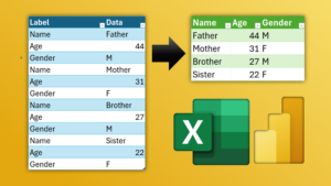
If you get data in a single column with multiple records, you can easily convert it to multiple columns using Power Query. Watch and Try with the Sample file we
If you get data in a single column with multiple records, you can easily convert it to multiple columns using Power Query. Watch and Try with the Sample file we
Pivot data using Power Query and Convert flat data with key – value pairs to tabular data. Simplify analysis. Use Power Query – Pivot Column for conversion. Download Sample File
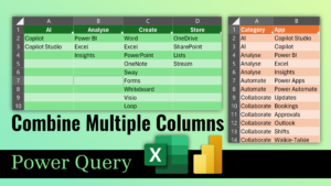
Clean-up data quickly using the amazing Power Query Convert multiple column data into two columns using Excel or Power BI with the UNPIVOT feature of Power Query. Download sample file

Learn all about sorting in Excel. Simple sort, multi-level, custom order, formatting and more … Two detailed videos. First one is about native Excel features. Second one is about automating

Finance and Accounting departments use Excel extensively. Advanced Excel is still the most sought after topic for training programs globally. We conducted this live event on 27th Feb 2021. This

Learn how to create a simple, but informative and interactive dashboard from daily updated data sourced from Johns Hopkins Institute. This uses on-cloud import using Power BI Dataflow. Interact with
Using Power Query, this type of work is extremely painless and quick. What’s more it refreshes data in just a click when more files are added.
While working with Power BI we often need to convert Seconds to Duration. This is easily done in Excel just by applying the formatting code “HH:MM:SS”. Unfortunately in Power Query
A brilliant new feature is now available in Power BI – Split column into rows. To understand why we need it, you must go and read the article – Analyzing


