Estimated reading time 3 min. Works with ALL versions of Excel.
The data is a list of sales transactions, two columns – amount and date.
We have 5000 transactions over many years. We want to know how the business grew year on year. Here are the steps…
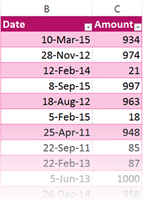

Download the sample file to follow the steps.
Go to the raw data and create a pivot table. Date in row area and Amount in value area. Drag the Amount column twice. This will help you understand how the calculation works.
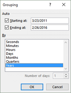
Now we need to show the data at yearly level rather than at daily level. Right click inside any date and choose Group… option. Choose Year (and unselect Month). Click Ok.

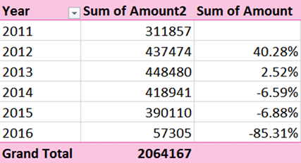
This is how you get yearly report. Now we want to compare each year result with its previous year and see the percentage growth. Subtract it and convert it to percentage.
The natural thought at this stage would be to write a formula in the next column. That is a very bad idea. As you may know already, The first thought which comes to our mind while working on Office is usually inefficient.
We must assume that Excel is capable of doing what you want, rather than trying to do it yourself. Let us find out …
Right click in one of the amount columns and look at all the options. Which one seems to be useful? Now, I want YOU to find the answer. Trust me, you will love the discovery process. And you will feel a sense of achievement.
I am intentionally keeping some area below blank.
Scroll down to know the answer.
Scroll down…
Scroll down…
Scroll down…
Scroll down…
YoY growth
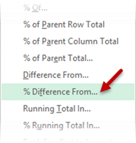
Go to Show Values As and choose % Difference from… option. This opens a dialog which asks you the obvious question: % difference from what?
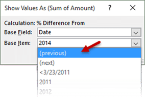
By default the currently selected year will be shown. But this is where the real power is hidden. Open that dropdown and choose Previous.
It means we want to take the value in each row (which is the value for a specific year), then compare it with the previous value, calculate the difference and show it as a percentage. Wow, the job is done.
So simple. So powerful. So intelligent. This feature has been waiting for 25 years for someone to click on it!
More refinements
You will notice that the year 2016 shows a reduction of 85%. But there is no need to panic. We have data only till Feb in 2016. It is a good idea to filter out the 2016 year to avoid confusion.
Now we can use Conditional Formatting – Data Bar to visually represent the growth or decline in a more appealing manner. And finally, there is no need for the original amount column. This leads us to the final, more refined pivot.
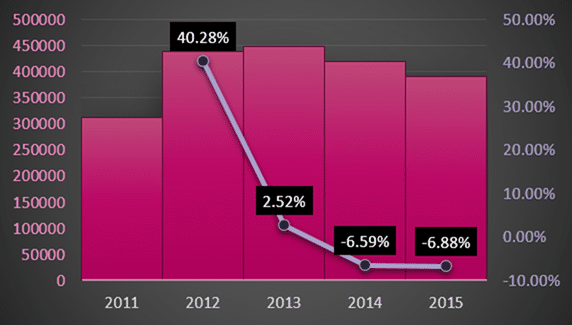
Here is another variation: a combo chart to show the actual revenue and the YOY growth.
Further thoughts
Learn all features available in Show values as. Read these articles:
Adding formulas OUTSIDE Pivot Tables = Inefficiency
Pivot Table – Show Values As – Part 2
Pivot : Show Values As – Part 3
Apply this principle to existing reports and enhance them.
Right Click to learn more!




3 Responses
Wow. This was an eye opener. Just fabulous Doc
Thanks Shreyas.
hi, i tried this but ran into a problem.
the pivot is structured as
customer sales by years (say 2021 and 2022).
so customer name in the row
years in the column
and sales value in the values
when i bring in the sum of sales again.. it adds two columns.. one is blank, the other will follow your steps.
is there a way to get rid of the blank column