We continue to explore Show Values As options in Pivot Tables. We will see the practical application of these options as well. Estimated reading time 10 min

Please read the previous article first. This is a continuation of the series.
Adding formulas OUTSIDE Pivot Tables = Inefficiency
Contents
Download Sample File
Download this file and follow along …
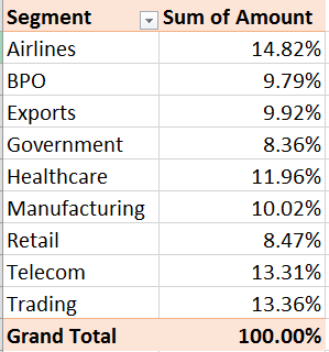
Create a Pivot Table from the data. Drag Amount in Data area and Segment in Row area. Right click in Amount (data area) and choose Show Values as – % of column total.
Percentage of Parent Row Total
This option is a bit tricky and difficult to understand. So let us start from the previous example. One Column shown as percentage.
Now the interpretation is easy. Value for each segment is the contribution to the total (which is 100%).

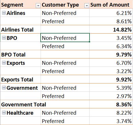
But now let us add Customer Type to the row area – below the Segment. Now try to interpret each value…
The values for Segment contribution are now subtotals (in Bold). But look at the value for Preferred and Non-Preferred customers. Those are also percentages.
Percentage of what? Grand Total. So it is very simple.
The Preferred and Non-Preferred values of each Segment sum up to give you the Segment total.
Can I compare a customer type value across segments?
For example, Exports Preferred is 3.22% and Government Preferred is 2.97%
Both values are contributing to the GRAND TOTAL. So in that sense they are comparable. But within the Preferred segment they are not comparable.
If such comparison is to be done, we need the Preferred and Non-Preferred values to total to 100.
The first field is the Segment – Customer Type is under it. Therefore, the Segment field is called the Parent Field and Customer Type as the Child Field.
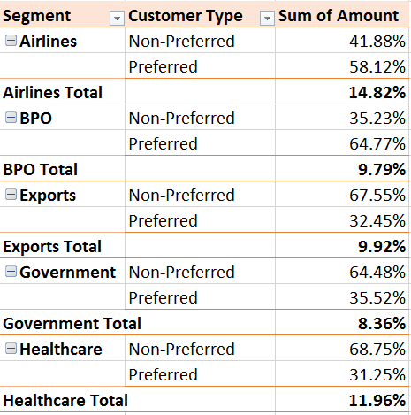
Now right click in the data area and choose % of Parent Row Total and see what happens.
Now we can compare Exports – Preferred contribution (32.45%) to
Government – Preferred contribution (35.52%)
All pairs of Preferred and Non-Preferred now total to 100.
Brilliant feature – but almost completely unnoticed. Some of you may have manually added these formulas to achieve this result!
If the same situation happened while these two fields were in columns, you should use the % of Parent Column Total option.
This option requires too much space horizontally. Therefore, Parent Row Total is visually easier to interpret.
What Next
Till now everything was being compared to the Grand Total. In the next article we will understand how to change the benchmark of comparison.
Articles in this series
Adding formulas OUTSIDE Pivot Tables = Inefficiency
Pivot Table – Show Values As – Part 2 (this article)
Pivot : Show Values As – Part 3
Pivot: Running Totals and Ranking
Adding calculations WITHIN Pivot Tables
The amazing Calculated Items in Pivot Tables
***


