Contents
Slides containing data pasted from Excel
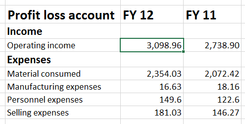
These type of slides are very common. They look uninteresting and shabby.
I am not talking about charts here. That will be the next article.
Here are some simple ways to make them appear more interesting.
Download the sample presentation from here
Problem: Everything from Excel looks B&W
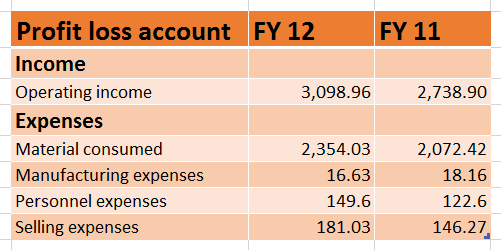
Solution: Use Excel Tables to make it more colorful
This works well if the data is tabular. Data must also have header for each column.
Select the data and choose Home tab – Format as Table – and choose the color combination you want. DO NOT choose color combinations which have banded rows with one band white. That white becomes transparent when you paste to PowerPoint. Here are the Safe Ones.
If you don’t use banded rows, then any color will be suitable.
When you create a table, AutoFilter dropdowns are automatically added. Remove those by going to Data tab – Filter. (Does it mean that if you want to have a table you cannot have a filter on. Yes – you need to work around the constraint. Create a Table – apply desired table style , convert it back to range – the formatting is still preserved. Then you can do whatever you want without any constraints.)
Paste it into PowerPoint (with Paste As Picture Option). Press CTRL key and drag from any corner to resize it. So far so goo.
Problem: The Data looks flat and visually uninteresting
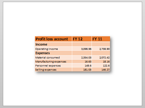
Solution: Use picture style and get some 3D feel
Click on the picture – Picture Tools – Picture Styles… Lots of them. Just move the cursor over each to view how it impacts the picture. Sometimes, the drop-down of the Picture Styles drop down overlaps the picture itself. Use a small picture and align it on the right side of the slide so that you can appreciate the look and feel of each option.
Find out the style which suits your screen-shot or picture. For Excel related data, this option looks very nice.
Now compare the same slide.
Before…
After …
You can appreciate it much better if you see it in a presentation. You can download this sample presentation and try it (see below).
Problem: Lot of data is shown and you want to focus attention on specific data
Solution: Do NOT show too much data
Although this is an obvious solution, in practice everyone still does it. So let us assume that we are forced to show a crowded piece of data and you still want to make it look good.
When lots of data is shown, nobody can read anything anyway. Now we want to focus on some part of the data specifically – that means people should be able to read at least that part… no problem – here is how you do it.
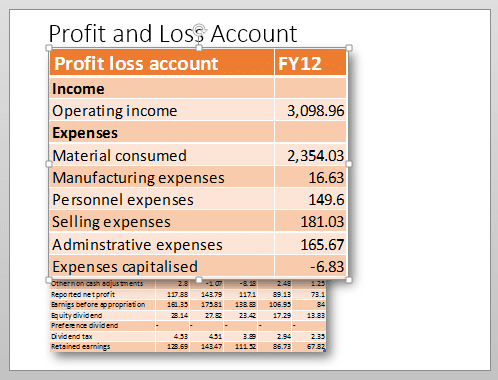
Consider this slide with lots of data. We have made it a Table and formatted it properly with a shadow as shown above.
- Copy that picture
- Move it aside so that you can edit it without confusion
- Crop the desired area
- Resize it to make it bigger
- Overlap it on the slide approximate where it belongs
- The shadow effect is still applied so this bigger image will appear to float over the original image
- Add Entry Animation of type – Zoom – On click)
- Also add Exit Animation – Zoom – On click)
- You can repeat this process for more detail areas as required. Remember to use animation painter to copy animation from one zoomed piece to another.
- Finally click on the original image – Picture Tools – Corrections – and make it a little darker. This increases the contrast between the original crowded image and the zoomed popups of detailed information.
- Default Zoom duration is 0.5 seconds. Make it 0.2 seconds to ensure that the animation itself does not induce sleep
-
Download the sample presentation from here


