Task Management Best Practices 2024 – New Planner
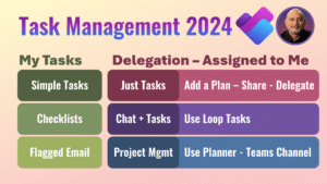
Learn how to manage tasks using the new Planner Office365 now has a combined way to handle your tasks, delegated tasks, flagged emails and more. Contents Related videos Task Management
Learn how to manage tasks using the new Planner Office365 now has a combined way to handle your tasks, delegated tasks, flagged emails and more. Contents Related videos Task Management

Use the new, powerful PivotBy function in Excel It replaces Pivot tables in many cases. To use multiple fields, you need to either use table syntax or HSTACK function. Download
Nowadays our files are on cloud – OneDrive, Teams and SharePoint. Files sync with local drive. Therefore, when disk is full, you must use the right way to clean it
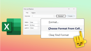
Learn a smart and useful technique to use Find Replace in Excel. Download sample file and try Contents Related videos Excel Best Practices – Data Management – Part 1 of

Learn how to find text inside another text or data using Excel. I want to count the number of times the text appeared. I also want to consider or ignore

Learn 16 best practices for Effective Teams Meeting Management. Understand how to organize, attend and follow up. Contents Related videos Teams meeting notes and action items Teams best practices

This is a very powerful feature of Office 365 or Microsoft 365 that is often ignored. You just go to the ‘Search’ inside M365 and get comprehensive results instantly. It

We have been using Google for decades. But here are 10 Best Practices to use it even more effectively. Less results and more precise results. Content

Stop copy pasting tables from documents. Use reusable tables. Create Quick tables from existing tables and use them across Word. Also available in Outlook. Related Videos Word Tables Best Practices


