When you have two columns of numeric data, Scatter chart helps you understand how they affect each other (jargon: correlation). Creating a scatter plot is easy. But interpretation can be misleading or even absurd. Let us explore how to create effective Scatter plots.
The data
Two set of numeric values which we want to analyze. Both sets of data can come from observations or business data. For example: age and weight, income and purchase amount, number of items produced and defects, volume of orange juice and acidity, IQ and Weight, the list is endless.
Ideally the data should be an Excel Table. Download sample file.
Why? When more data is added, chart is auto-updated. Plus many more benefits.
Read this: Knowledge Pack – Excel Tables
One is plotted on X axis and the other on Y axis. Either of them can go on any axis. Sometimes we control one of the parameters – for example – fuel input. The other parameter is the effect of the first one – speed of the car. In such cases, the Fuel input should go on X axis.
Contents
Create a Scatter chart using any version of Excel
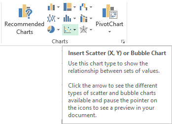
Select the data and choose Insert – Scatter Chart. Note that Recommended Charts will show scatter when it finds more than one numeric columns in your data.
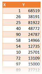
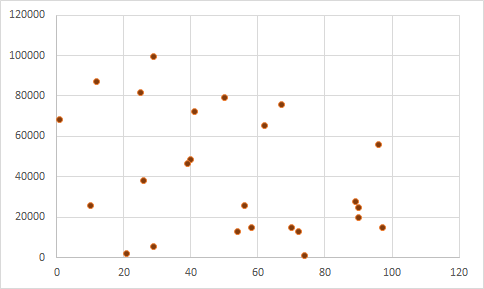
The default chart shows one dot for each row of data. It finds the exact value on X and Y axis and then plots the point accordingly. This shows you the overall pattern. Now we can visually try to understand if these two things seem to be related to each other.
There is a lot of science behind interpreting this.
But in simple terms we are trying to answer questions like these.
- If X increases what happens to Y
- If X increases and Y changes (increase or decrease), is it following a pattern?
- If X changes, how much will Y change?
- If change in X is changing Y, is it always working? Or Y stops responding after a while?
We are looking for the direction (Y goes up or down with X increasing), form (the overall shape), and strength (Y changes predictably or randomly).
Reaching a visual conclusion is NOT the end point. You then have to ask yourself, whatever seems to be the relationship between them, does it make sense from a practical and business or scientific point of view.
If it does not make sense, whatever conclusion you have got may be true, but useless.
If it does make sense, think of utilizing that information to your advantage in whatever context the data originates from.
Here is a more detailed discussion of interpreting scatter plots.
Variations of Scatter Plot
Right click on the Scatter and try different variations of scatter plots which Excel provides. Each one is useful in specific situations.
Trendlines
The correlation can be viewed more easily by adding a trend line. There are many types of trend lines. You must choose the one which represents the practical context of the data.
For example, if you have just started business and are looking at its growth or decline, you must use Exponential type of trend. But if you have an established business, you should look at Linear trend. Here is how you choose the type of trend line.
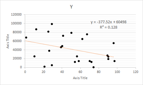
Right click on any point in the plot and choose Add Trendline. This is how the linear trendline looks.
A faster way of putting a linear trendline, display the XY equation and R2 (R square) value in just ONE CLICK is to choose Quick Layouts after drawing the base scatter chart.
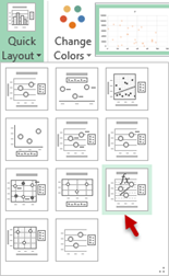
Even if you don’t understand statistical concepts, you must see the value of R square. If this value is nearer or equal to 1 the trendline is showing is reliable trend. Otherwise it is not significant, even if it shows an increase or decrease. So if your profit trendline is falling and R square value is 0.01, then you don’t panic!
Error Bars
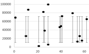
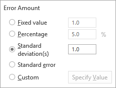
Error bars are small little lines around the plotted dot which indicate how much it deviates from some other reference value. Here is the same chart with difference from the standard deviation. Although it looks confusing at first, understand the concept and then you will love this feature. It gives you a more realistic picture of the data and helps you interpret with more accuracy and confidence. Read details here.
Example
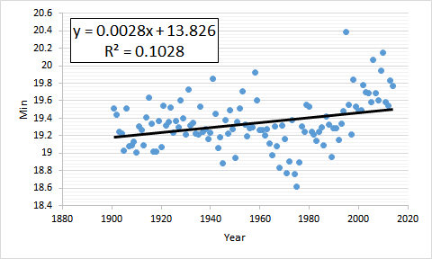
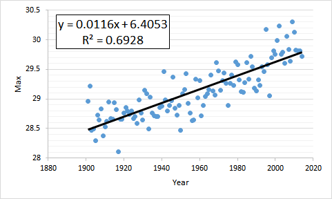
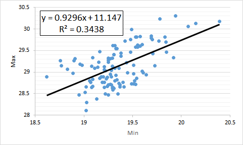
Here are three scatter plots showing average temperature in India across years.
Source Data.Gov.In
Year and Min temperature
Year and Max temperature
Min and Max temperature
You can try our own interpretation and learn from it. Here are a few observations.
- All variables show positive correlation – when X increases, Y also increases. This is obvious.
- But the Max temperatures have been increasing more than the minimum
- The highest correlation is between time and maximum temperatures (highest R square)
- Notice that higher R square visually means that the actual data points are nearer to the trend line throughout the trend line
The third chart also has higher density of points but that is only in the middle portion and the spread is bigger – hence lower reliability (lower R square) - In the third chart, there is more correlation in the center of the diagram between Min and Max temperatures.
- In the 80’s the minimum temperatures were at their lowest.
Now from a practical point of view, understanding that minimum temperature must be affecting maximum temperature is easier to explain. However, as time progresses, both temperatures are increasing – this in itself is not explanatory. But we need to correlate it with real life situation of global warming and then the correlation is clear.
Animation
Yes. Like all other charts, even Scatter Plots can be animated in PowerPoint. Read this article to understand how to animate charts.
Download this presentation to view an animated Scatter chart.
Scatter Charts using Power View
Power View is a new method of visualization introduced in Excel 2013. It offers many interesting features for scatter plots. I will cover it in a separate article.
What Next
In the next article, we will cover the seventh quality tool – Flowcharts.
***

