Read Histogram and Pareto articles first. Excel Data Analysis tool can create a Pareto chart while creating a histogram. Small tweak but very useful.

Contents
How to do it?
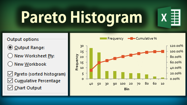
Histogram divides available data into bins and plots the frequency as a column chart. This is done using the Data Analysis ToolPak. In the Histogram dialog has options for Pareto as shown above.
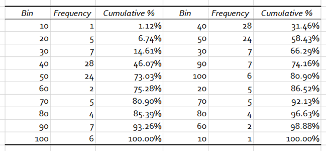
Enable Pareto (sorted histogram) and Cumulative Percentage options and draw the chart from raw data. That’s it. Here is the data which was created by the Histogram tool. The chart is shown above.

Download this sample file and try it yourself.
Of course this can be done using Pivot Table grouping method as well (requires Excel 2013 to get % Running Total). You can read details about it in this article. Pivot Table bin size is fixed. In case you need to have bins of dissimilar sizes you need to use this approach.
Practical Usage
Histogram is used to understand frequency distribution. Usually these frequencies are sorted in the natural order of the bins. If you want to look at the more important bins and see their influence on overall distribution in percentage terms – you need Pareto.
The generic learning
Well, there is more to learn – beyond Histograms and Pareto Charts.
While analyzing data, also look at
- various forms of sorting
- consider cumulative numbers, over bins, categories or time
- consider looking at cumulative summary as a percentage of grand total
- Correlate the sorted version with the cumulative percentage (this is the obvious one. but this leads to another generic thought)
- Correlating two things which are difficult or impossible to do numerically – use a combo chart
- For any column or bar chart, consider whether gaps in the bars are required or not
- For any series of data, consider whether it needs to have data labels.
For example, in our Pareto charts, bars did not need data labels whereas the cumulative percentage was meaningless unless the percentages were shown - Data labels in cumulative series are more useful than non-cumulative ones
Well, this is a demo of how to learn – really learn – from specific to generics. Enjoy.
***


