Office 2016 has introduced two new charts for hierarchical data: Treemap and Sunburst. Let us explore Sunburst in this article. These charts do NOT work as Pivot Charts. We will use the same data as last time.

Photo credit: shoebappa / Foter / CC BY-NC
Contents
The Data
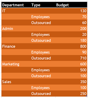
Let us start with the same data as the Treemap article. Notice that this data has main category of Department and sub-category of employee Type. This data has sub-totals by department. For example IT = 130 = 70+60.
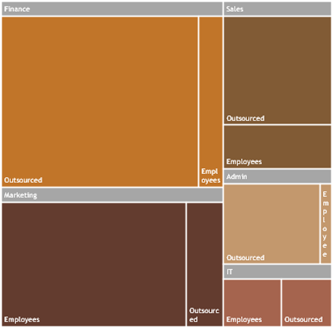
The Treemap shows the hierarchy as boxes of proportionate sizes. Now let us try the Sunburst chart with the same data.

Unfortunately, it does not work as expected. There are gaps in the second level – Type. Sunburst does not need subtotals. It just requires the data at lowest level of hierarchy.
We will change the data by removing the subtotals and creating a simple-two level hierarchy. This is more like the Tabular format of Pivot Tables – without sub-totals.
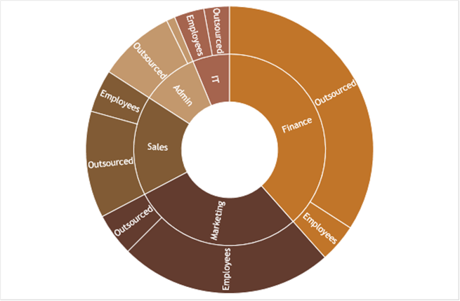
Now the sunburst chart works perfectly. It is a multi-layered donut chart. Inner circle is the first level of hierarchy, outer circle is the second level and so on. This chart does not have any special options in Format Data Series.
Three level hierarchy
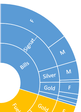
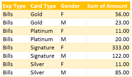
The Sunburst chart works even if the data has repeated labels like so:
Remember to try these charts next time you are working with multi-level data. If data originates in Pivot Table, remove sub-totals, make the layout Tabular and copy paste the data before creating these charts. (it is called a Flattened Pivot table).
When pasted into PowerPoint, Chart Animation does not work with Treemap and Sunburst type of charts.
Sunburst requires at least two levels of hierarchy.
With just a single level of data, it is like a simple donut chart.
Sunburst Charts are not visible in older versions
These new charts are available only in 2016 or above versions. If the file is opened in an older version, the chart is not visible. You see this instead:
We will explore more new chart types in future articles. Enjoy!
***




![image[9][1] image[9][1]](https://5ecacaf0.delivery.rocketcdn.me/wp-content/uploads/2015/10/image91_thumb.png)


