We have been using Pie Charts for decades. Although these are useful for looking at proportions, there are disadvantages. Now, we have a more effective and easier to interpret chart available in Office 2016 – Treemap. What’s more, this chart is available for all devices – including mobile phones!

Contents
Pie Charts: The limitation
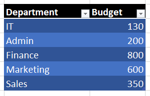
Pie charts show the proportion of various data points in a series. Here is the data which is used to draw both the above charts.

I have intentionally removed all the Data Labels and Legend. The problem with pie charts is that of interpretation accuracy. If you look at two pieces of the pie, you form a mental picture of their relative sizes. How accurate that picture is – that is the real question.
In case of Pie charts, we are supposed to compare pieces which are an arc – a piece of the pie. Multiple such pieces confuse our vision and therefore the relative size interpreted by us need not necessarily be the actual size.
In many cases, the percentages or data labels are not shown on top of the chart – leaving the job of interpretation entirely to us.
New chart type: Treemap
Now compare this pie chart with the other chart. Treemap was introduced in Office 2016. It is available in all editions on all devices (including Mobile Phones).
Try to interpret the relative importance of various data points in the treemap.
For easy comparison use the black and purple areas in both charts. Notice that the relative importance of these two areas is much easier to assess when it is a rectangle rather than a pie. That is how you will interpret things better.
Next step: Multi-Level Data
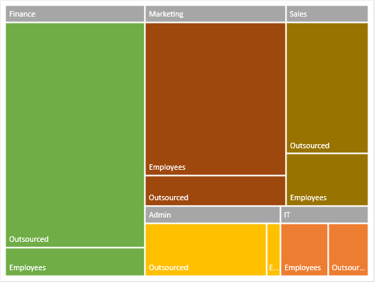
If the data was like this, a pie chart cannot be drawn at all. But Treemap is DESIGNED for such data.
This is how the Treemap looks now. Much more easier to interpret – within as well as across categories.
Displaying the Category label more prominently

Right click on any item and choose Format Data Series. Now you get a useful option: Banner. What we have in the chart above is Overlapping labels.
Banner labels look like this.
Remember to try Treemaps with hierarchical data next time onwards. Remember that Pivot Tables often have hierarchical data and are good candidates for Treemaps. However, Treemap (and many of the new charts) do NOT work directly with Pivot table. This is because, Pivot Table can layout data in so many different ways. These new charts require data in a very specific way. However, you can always use Pivot table reference and draw a regular chart from it (not PivotChart).
Another type of new chart called Sunburst is also designed for hierarchical data. We will learn it in another article.
When pasted into PowerPoint, Chart Animation does not work with Treemap and Sunburst type of charts.
***


