This dangerous mistake while comparing percentages: I really don’t know how the world is still working. This is probably the most useful service I have done to humanity till date! It is dangerous mistake and is extremely common.
Read it NOW or view the 5 min video. Share it with everyone you love.
[youtube https://www.youtube.com/watch?v=CKaYH0PJDug?rel=0]
Contents
The problem
Let us start with extremely simple data – four rows. I have also created a pivot table for it – which shows the same output as there is only one row per month in the raw data.

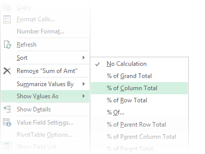
Now let us show the amount as percentages. Right click in the Sum of Amt column and choose Show Values As – % of Column Total

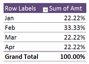
Now the Pivot Table shows the percentage contribution of each month and grand total shows 100.

Now let us make ONE change which will create a huge problem for us. I changed the Feb value and refreshed the Pivot Table.
As you can see, Feb is contributing 33.33% to the grand total and others are contributing lesser. So far so good. Now let us find the answer to this simple question…
How much bigger is Feb value compared to the Jan value?
Almost everyone has an instant answer – 11.11 percent!
And unfortunately,
your answer is grossly inaccurate.
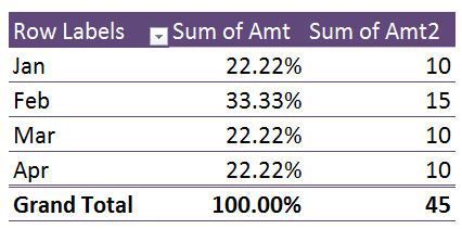
Let me show you the actual data. Feb value is 15 and Jan value is 10.
So the correct answer is 50% – not 11.11 %
What was the mistake?
The mistake was to compare the percentage contribution of Jan and Feb to the grand total instead of comparing the ACTUAL values of Jan and Feb.
The learning is – if you are doing a comparison between two values (Jan and Feb in this case), no other values should affect the comparison (values of Mar and Apr).
It sounds simple enough and obvious enough. But we still end up making this mistake.
Global impact of this misinterpretation
Can you imagine how many times this type of misinterpretation must be happening globally every day?
How many years this must be happening for?
How many wrong decisions have been taken as a result of this misinterpretation?
I don’t know if anyone has done a global survey or impact analysis of this problem. If you come across any data on this, please post it as comments here ( or send a mail to me at nitin@maxoffice.biz).
How do we interpret the values accurately?
In our example, the data is very simple. Viewing the actual data gave us the right clue. But in real life – the raw data will be very large. So how to avoid this dangerous misinterpretation ever again in life?
Pivot Table already has an answer for this. Just add the Amount column again. Now you can see the actual values. Hopefully that will prevent you from making the wrong interpretation.
This is a good start. 10 and 15 are simple enough to interpret. But in real life, numbers can be large – making the comparison more difficult.
Difference From … option
Click in the value of Jan and Right click in the data area and choose Show Values As, Difference From …
It will confirm that you want difference from the JAN value (because currently the data from Jan is selected).
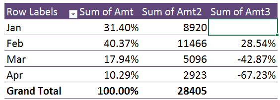
Now Pivot shows the difference between Jan and Feb (as well as all other months).
This is much better. Now I know that the base value of Jan is 8920 and the difference between Jan and Feb is 2456.
But do I really want to know the absolute difference? Or I just want to know the percentage by which Feb is more compared to Jan?
In this case, I will have to compute this percentage. Why take this trouble when Pivot can do it for us?
Click in the cell Jan – Sum of Amt3, Right click in the third column and choose Show Values As – % Difference From … (accept Jan).
Now finally we see exactly what we wanted – with accuracy.
The value of Feb is 28.54% more than the Jan value.
% difference from WHAT?
Just to clarify – the percentages shown are to be compared to the value of JAN (in this case).
DO NOT COMPARE THEM TO THE PREVIOUS MONTH.
Thanks Aaron Tasker for pointing out this potential confusion.
Percentages shown in rows have similar danger of misinterpretation
Here is the same data shown horizontally with the setting % of Row Total. This is also equally amenable for misinterpretation.
Unfortunately, the % Difference from calculation works only in column context. Therefore, it is better to show percentage contributions vertically rather than horizontally.
Important: Jan is just an example
The concept can be applied to any month or any item in row or column area. Jan vs. Feb was just an example. As you saw, even though we wanted to compare one value with another, Pivot Table compares the selected value (Jan in this case) with ALL OTHER VALUES.
Once you choose a particular item as the basis for comparison – Jan in this case – you need not stop there. Depending upon the business context, choose other items as well and see the comparison. Don’t get stuck into thinking that you must choose just ONE base value for comparison.
The whole purpose is to learn as much as possible so that we can act better and improve the future. So go for it. Use your common sense, domain knowledge and business context to utilize this concept to your advantage.
Thanks Aaron Tasker for pointing out
Key learning
Interpret percentage contributions only to compare CONTRIBUTION TO TOTAL.
DO NOT use these percentages to compare values with each other.
Share this information
Think about it – could your colleagues, boss, subordinates, friends, kids, bf/gf, spouse, parents, customers, vendors be committing the same mistake? Obviously! So share this article with them.
Knowledge is the best gift!
*** ***


3 Responses
Great tip, Doc!
A very important tip! Do you think however that in your example each row could be misinterpreted as the difference to the prior month, rather than the difference to January?
In this case the Base Item when using the ‘Show Values As – % Difference From’ could be changed from ‘Jan’ to ‘(previous)’,
Hi Aaron
Thanks for the comment. I have updated the article as per your suggestion and acknowledged your contribution. Cheers.