Let us explore numeric grouping in Pivot Table with the Ageing Analysis scenario. Estimated reading time 7 min
Estimated time saving – hours!
You must read the previous article for maintaining continuity.
Ageing analysis in seconds (Number Grouping in Pivot)
Earlier we saw how to get this report…

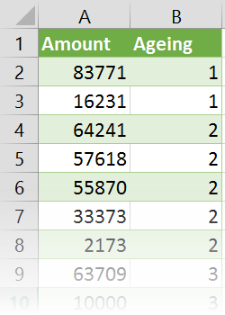
from this data – in seconds.
Contents
Credit Period is 90 days
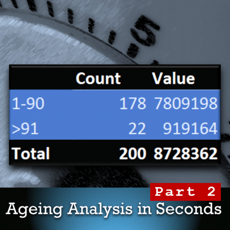
If the credit period is 90 days, you may only want to see two categories – above 90 and below 90. That will provide a much simpler and more relevant analysis.
How do we do this?
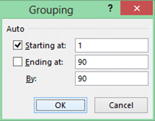
Do you remember that I asked you to understand this dialog very carefully?
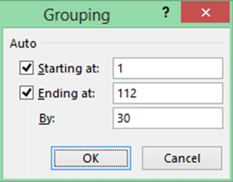
The By option is easy. We have put 30 as the bucket size there. You can change it – it is an editable text box after all.
But what else is shown there and why?
For our convenience, Excel is showing the minimum and maximum values from our data. Which is good. It saves me the trouble of going to raw data, sorting it on Ageing and looking at the boundaries manually.
But did you notice that those two values are NOT labeled as Minimum and Maximum?
Did you also notice that those values are not just to inform us about the limits.
Those are text boxes – which are editable.
WHY?
Most of us would not want to answer that question.
Why Microsoft made it editable is Microsoft’s problem. NOT mine.
But wait! Why did Microsoft make it editable? For no reason?
Think a little about it and then you will suddenly realize the reason.
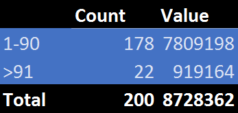
We want to show only two categories. Below 90 and above 90.
So can we change the Starting at, Ending at and By values to get this result?
Now we get the result we wanted.
That is how you observe what is available, apply little bit of curiosity and then you will start learning.
Did you notice the tick mark next to Starting At?
What is it telling us? Also notice that there is no tick mark next to Ending at. Why?
What is this tick mark doing there? Try clicking on the tick mark next to Ending at and you will realize why it is there. It resets the value to the maximum value.
Missing tick mark also indicates that the value is manually altered. If there was no tick mark, you or others would have thought that the maximum value in the data is 90 – which is not the case.
Imagine the amount of detailed thought which has gone into making this small little dialog?
Start noticing these things, thinking about them, using them to your advantage and then you will begin to appreciate the depth and breadth of this totally underutilized miracle called Office!
Volume Value Analysis
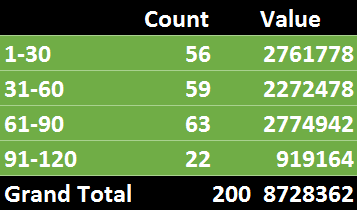
Change the grouping to 30. Now think. Can we make this make it easier to interpret?
Can I compare the count 56 with value 2761778? Not possible.
But why would you want to do that? Because I want to know how important it is in the context of volume (number of invoices – the count) and Value (the total amount).
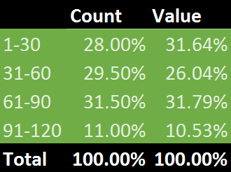
It is not possible to compare the two values as they are. But what if we convert both to percentages of their grand total? Then they suddenly become comparable.
We will use the immensely powerful Show Values As option – % of column total on both columns in data. (Right click – Show Values As)
The same data is now telling us much more useful information. In this case it is random data so there is not much difference between count and value.
We are most worried about those invoices which are beyond credit period. Suppose the count was 40% and Value was only 12% we will not worry too much about it. Because the amount is small.
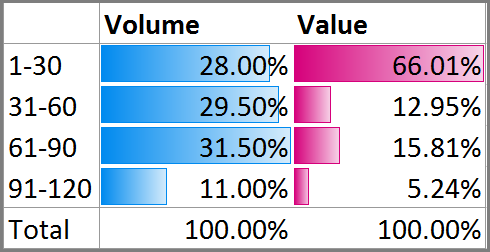
This kind of volume value analysis can be simplified further if you add Conditional Formatting – data bars.
I have removed the color from the pivot table and changed the data to illustrate the usefulness of Conditional Formatting.
I don’t have to explain anything now. The data is screaming at you.
Anyone seeing this report will be able to understand the situation and take relevant action.
The above 90 invoices are not worrisome because it is only 5% of outstanding amount.
Remember that after 90 days, the 1-30 category will become overdue. So we must proactively follow up with customers before it becomes a worrisome situation.
Also notice that there will be lot of customers to follow up with as almost one fourth (28%) invoices belong to the big value category.
What cannot be done
Here we have uniform bin sizes. But often we want dissimilar bins.
1 to 30, 31 to 80, 81 to 120, 121 to 190, above 191.
This type of analysis cannot be done using Pivot Table.
We need a lookup table for this. We have to combine the lookup table with an additional column in the raw data and use VLOOKUP to get the bucketing or categorization.
We will cover this in the next article.
Articles in this series
Grouping Text in Pivot Tables
How to correct spelling mistakes while analyzing data?
Ageing analysis in seconds (Number Grouping in Pivot)
Ageing Analysis (Numeric Grouping in Pivot) – Part 2 (this article)
Ageing Analysis (Bucket Analysis) using VLOOKUP – Part 3
Grouping Dates into months, quarters and years – in seconds!
Custom Date Grouping using VLOOKUP
Grouping with Date – Time Data using Pivot
***

