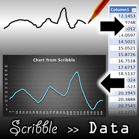
This is a utility I created along with Raj Chaudhuri many years back.Use the scribble tool to draw a waveform or shape, the utility will create the data for it.

You can then create a line chart which looks similar to original drawing.
Try it out.
Contents
Disclaimer
Use it at your own risk. We have done reasonable amount of testing but we cannot guarantee that there are absolutely no bugs or side effects. The error handling is basic. We have not taken the trouble to handle rare possibilities and extreme scenarios. The idea was just to get the tool available.
Use it in a fresh new file so that it does not interfere with or affect any live data.
The source code is free to use and modify. If you use or modify the source code and use it elsewhere, do mention about us.
The need
Often we need to illustrate some forecast, fluctuation, some abstract concept in the form of a chart. You know how the chart should look and depict the idea or progression. But we cannot create a proper Excel chart unless you have data for it. Unfortunately you only have a visual pattern in mind – no data.
That is why we created this tool. The concept is simple. You draw the desired curve and then this tool (it is called DrawData) will generate the data for it.
Once the data is ready, you can create a line chart using standard Excel features.
Of course, you can also create other type of charts as well…
Practical Scenarios
You have an idea in mind and you want to illustrate it using a proper chart – not just a paper scribble.
You want to plan or forecast or predict some fluctuation and then generate data for it which can be used for further modeling, what-if analysis or manual refinement.
Of course, you may discover more uses for it. If you do, please post it as comments so we can also learn from it.
Suggestions for enhancing the tool are most welcome.
Download the tool
Unzip it. There is one XLSM file. Open it. You will have to trust it and enable macros.
How to use DrawData tool?
It is a simple but powerful tool. Draw the curve first. DrawData will then generate numeric data for it. You can then use the data for drawing charts.
Create a new, blank file. DO NOT use this tool with existing files which already contain data. Once data is generated, you can always copy it to the desired file.
Step 1
Draw the curve. How? Using any of the drawing tools.
There is only one rule. Whatever you draw should be linear. No closed shapes, no overlapping lines, no loops.
These shapes are ok. These are just sample shapes. You can draw any shape as long as things don’t overlap or form loops.
These shapes are not ok. The tool will work, but the data will UNWRAP the shapes. Data is plotted in linear manner. Therefore, the original shape will not be plotted, a straightened version will be plotted.
Select the shape and run the DrawData macro
Click on the shape. Only ONE at a time please.
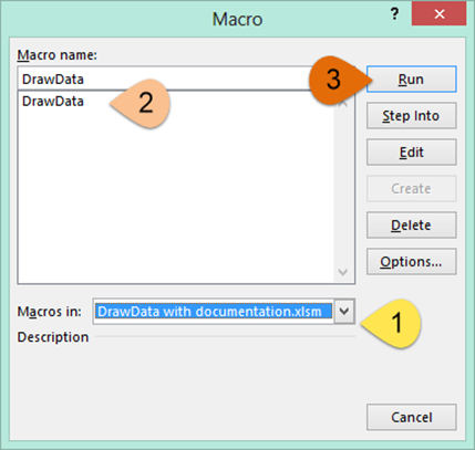
Now choose View tab – Macros to see the list of macros. You may have many macros listed there depending upon your setup. Make sure you choose the DrawData With Documentation file from the dropdown at the bottom to avoid confusion.
Now select DrawData macro and click RUN.
Select Settings and Generate Data
The settings are very simple.
Number of Data Points
Depending upon the shape complexity, the maximum number of data points is automatically calculated. You can reduce the number, but you cannot increase it.
We recommend that you try with the recommended number and reduce it only if required.
Select Starting Cell
Specify where the data is to be generated by selecting the starting cell. Make sure that the file is empty. If you have some data already, it will be overwritten without warnings. We are not responsible for data loss or any business impact due to it.
Smoothening
When you draw free form line squiggles using a mouse, the curves are ragged due to shaky movements. If you want to smoothen the curve, choose the Smoothen option. By default this is done using a moving average window of FIVE values. If you expect large data to be generated (you have a long and complex waveform) you can choose a higher value.
Generate Data
Finally click Generate. Straight lines create lesser number of points. Freeform and curved shapes generate more data points.
Data is generated in the sheet at the selected cell. The dialog is still open in case you want to retry with different settings.
We suggest you try without smoothing, with smoothing of 5 and then with different smoothing value till you get desired results.
Remember to change the output cell before you generate data. Otherwise you will get an error. Don’t be scared about the error message. Just choose another cell in an empty area and try again!
Now draw a line chart using the data
This you already know. Click inside the table, choose Insert – Line chart and choose the chart type. That’s it.
In most cases, the chart should match your original curve. You may get some variation depending upon the smoothing value or complexity of the curve.
Here is the input and output.
Here is the data which was generated for this waveform (without smoothing).
What happens if closed shapes are used?
Data does get generated. But it is straightened out. Here is an example.
This is the input shape.
This is the output chart.
Share it if you find it useful
Do give us your feedback and suggestions.
***


One Response
This is useful. But is there anyway I can link the newly generated data to values in an original graph ? . I understand that the scribbled line doesn’t have any relationship with the original graph axis but if I want to create a slightly different version of my graph by scribbling a line by hand can I influence the numbers of the newly generated data set to link to the original data in my graph ?