Older version of Excel could display only 52 colors. New version (2007 onwards) can display 16 million colors. Yes, that sounds like an overkill, but Excel uses this extra capability in a brilliant way. It provides us with a very easy and useful method of using color to understand information more easily. Read on to find out how…
Contents
Using color coding
Let us take a simple example to understand the concept.
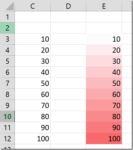
The data on the right side is the same as left side. It uses color. The lowest value is white. Highest value is red and the intermediate values get a mixture of Red and White. Therefore 50 is PINK in color. More red means higher value. Less red mess lower value.
This is how the ability to display millions of color shades is utilized intelligently. Of course, in this case it does not make much of a difference because we can obviously notice that this is a simple series with an increment of 10.
But let us look at similar data – between 10 and 100 – with the same color coding, with lot more numbers.
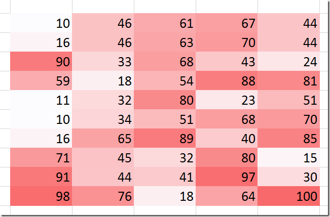
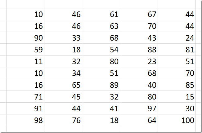
Now at a glance you can see how the high values are distributed versus low or medium values. Try doing that without the color – the data is same.
This is how color coding of information becomes useful. This is also called a heat map.
What if the data is very large?
If you are looking for patterns of data distribution, you must zoom out so that you can see the whole data and get an overall picture. There is a limit to how many rows and columns you can see in a single screen. If the data scrolls beyond that limit, this feature is not going to be of much use because our brain cannot remember the visual image across multiple scrolled screens. With a larger resolution screen you can increase the amount of data seen. But even screen sizes have limits.
Here is a representation of large amount of data – which still fits one screen after zooming out to 10%. At this level you cannot see individual number – nor do you want to see.
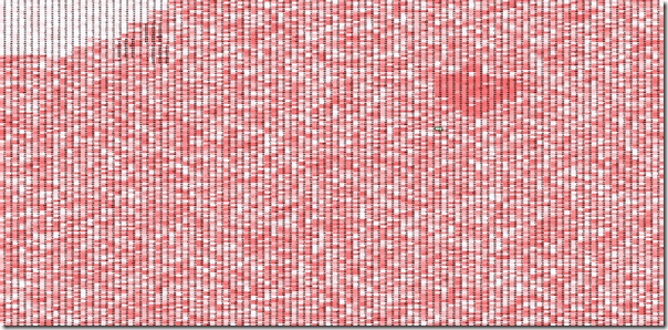
Here you can see low value cluster in the top left corner and a high value cluster in the top middle region. Now you can zoom in and see the details if needed.
Choose 2 or 3 colors
Till now we have been choosing two colors. But Excel also allows us to see three colors. One for minimum value, one for maximum value in the range and one for the middle value (50th Percentile by default) . Here is the data shown earlier color coded using three colors – Red Green Yellow.
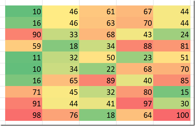
Choosing colors
Whether to choose two or three colors is up to you. It depends upon what you want to see. Three colors do clutter things a bit more. For people who are not used to this concept, three color coding is more difficult to interpret than two color coding.
Choose colors which make business sense. For example if you are showing temperatures then choose BLUE and RED as boundary color. If you are showing agricultural output then choose Green for the maximum value. If you are showing altitude or ocean depth, then use light blue and dark blue combination.
If the range is less – for example a score from 1 to 5, then color coding is not very useful because there are only a few variations of color available. In this case you should use another method. Read these articles for details : Show High, Medium, Low values in few clicks and High, Medium, Low – visual categories – In-Depth
Think about where you can use this facility
I am sure you are already thinking about it. There may be many reports you generate or data you analyze. Whether you do summarization and interpretation of data manually or using Pivot Tables, Power Pivots, think of whether color coding like this will enhance the report.
If used appropriately, it will help you as well as whoever receives the report.
Think of using this when you are sending reports to your customers, dealers, suppliers or vendors.
This feature will help them understand some useful information which may not be noticeable at all. If nobody notices something that is useful, nobody will take action on it. This means it is a lost opportunity.
How do you do it?
So far so good. But you still don’t know how to use Excel to do this color coding. In fact, I kept this part intentionally towards the end.
Why? Because the concept is more important than the operational skill!
Here is how you do it.
Select the data
Choose Home tab – Conditional Formatting – Color Scale
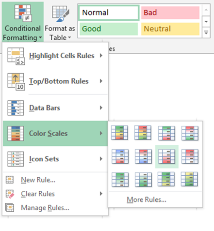
Choose two or three color scales – hover mouse to see the effect.
Make sure the colors are logically correct – higher value should have stronger color.
That’s it.
Customizing the colors
After applying the color scale option, you can modify it to your liking.
Conditional Formatting – Manage Rules – Select the rule and double click on it or choose Edit Rule.
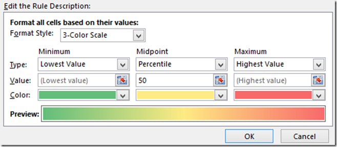
These are the default settings. You can choose various options like the color the starting and ending points (which by default are min and max in the range), the middle point.
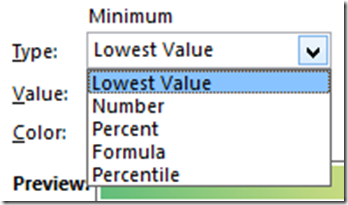
This is similar to other types of conditional formatting like data bars and icon sets.
Apply this to your day to day work and post some examples here. Also post your comments.
***


2 Responses
Hello Sir,
Thanks for this wonderful article. I was just wondering if we can do the reverse of this? Say for example I have a color in one cell, can I use some formula or something and get a no. against the cell? Can excel do that for me?
Looking forward for your reply.
Thank you,
Hi Hitesh
What you are asking for is not available out-of-the-box. Little bit of VBA programming required. I will write an article about it soon. I have added it to my topic list.