Please read the previous article so that you understand the context of this article.
In the previous article we saw how to divide available data into three categories: High, Medium, Small. In this article we will explore how to refine this process and have up to 5 categories of classification. We will also see how business context helps you decide the type of visualization.
In the last article we learnt how to classify data into small, medium and high categories in a visual manner WITHOUT creating a chart. Now we will explore more ways to visualize information in a more flexible manner.
We saw how to visualize data in three categories, which visually show 33%, 67% and 100% of the data range…
Above, below, between … these words make you depict data which is above or below SOMETHING. What is that something? As we saw in the previous article, that something is based upon the min-max range of the data you have.
There is a sense of direction … above something, below something, between something… that something being the range of data divided into three equal pieces. So far, so good.
This is called directional information – above, below, in-between…
Contents
Conclusive data
But in some cases the data is NOT directional. For example, if you have less than 35 marks, you fail the exam, if you have 36-45 marks, you have to re-appear for the exam and if you have more than 45 marks you have passed.
In this case, the arrows are not conveying the right meaning. We need a different visualization and a different benchmark.
Here is how you do it. I am keeping the data same to simplify things.
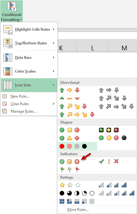
This time we will use a different set of icons (visual elements) by choosing – Home tab – Conditional Formatting – Icon Sets –
Now the same data looks like this…
What has changed? Compare this with the arrows…
The difference is that instead of tick mark, cross and exclamation mark; earlier we had an up arrow, horizontal arrow and a down arrow. However, the distribution is the same. Only the visualization has changed. How was this visualization achieved?
It was achieved using EXACTLY THE SAME logic –
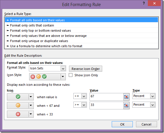
Excel calculated the min-max range – which is 36 to 99 and divided it into 0-33, 34-66, 67 and above – three pieces and specified different icons. The logic is same. The visual impact is different.
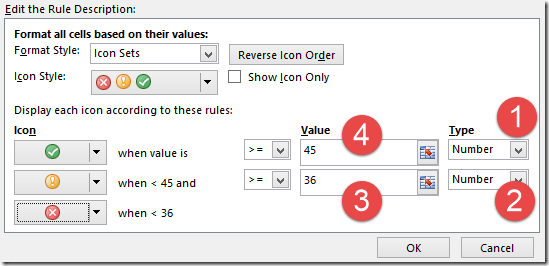
But our requirement is different in this case. We want to say that anything below 35 is fail, 36 to 45 is ambiguous (re-examination) and above 45 is pass.
How to customize the categories?
This is easy. Open the type dropdown and choose Value for both items…
Now the visualization is based upon ABSOLUTE VALUES rather than percentage of the range.
Spend some time playing with various options here and then you will get the comfort and confidence to utilize the right options.
Three, four or five categories…
Till now we have only categorized the data into three categories – either by number or by percentage of the range. If you want, you can classify the SAME data into FOUR or FIVE categories as well. How?
By choosing different icon sets…
Three categories are 33, 67, 100 %
Four categories are 25, 50, 75, 100 %
Five categories are 20, 40, 60, 80, 100 %
In each case you have a choice of visual icons.
Which icon to choose depends upon the context or the meaning you want to convey.
Which visual icon set to choose?
This depends upon the context. Notice that the visual icons are of different types: Directional, Shapes, Indicators and Ratings. However, irrespective of the type, there are only THREE types of categories – 3 classes, 4 classes, 5 classes.
Now it is up to you to choose the right type of visualization and categorization which suits your requirement. That is called Applied Knowledge. This is something you learn on your own. Spend some time tweaking these options and then you will be very good at it.
But nobody is asking me to use this feature…
Obviously. Because nobody knows that this is possible (including your boss!). But now that YOU know about this, why don’t you think of enhancing existing reports by using the right kind of visualization and making the interpretation simpler for everyone!
Practical action plan
- Make reports the way you do traditionally…
- Look at the final report ( it could be manually calculated or a Pivot Table)
- Think of the context
- Find the best set of icons which will depict the meaning in the most logical way
- Decide whether you want 3, 4 or 5 categories
- Decide whether you want the categories to be automatically calculated by Excel or you want to specify the boundaries
- Choose the right visualization and enhance the report
- Send the enhanced report along with the original report
- Explain the benefits of the new visualization to the recipients of the report (your boss)
- Standardize the visualization for future reports
What next?
If you have any questions about this concept, please post your queries here. If you could enhance existing reports using this feature, feel free to post the samples as well.
In the next article, we will explore more ways of understanding information visually, WITHOUT using charts. This is also called Conditional Formatting.
***


2 Responses
That was a very useful Insight and Tip Doc. Certainly this feature is very useful one for enhancing reports, and you explained it in a very simple and effective way. Thanks!
Couple questions here:
1. Is there any possibility of extending the Icon sets to Include custom Icons we may have?
2. If I have to show a different Icon for Maxima and Minima values, which are separate from the regular Icons available for all the values in between – How to achieve the same, If possible?
Hi Arjun
Thanks for the feedback. Here are the answers:
1. These icons are designed to match the KPI icons in SQL server. Therefore, these are hard-coded and cannot be extended. There is a workaround using Symbols which is shown here
2. Office 2010 allows you to choose different icons for each condition. Open the Edit Rule dialog and open the dropdown next to the default icon. Now you can see all icons and choose the one you want.
You may also want to NOT show any icon in some cases. For example, you are only interested in the high values and not in the low or medium values. This is also possible to set from the same dropdown.