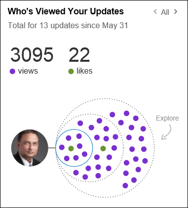
If you use LinkedIn and post lot of stuff, you will like this post. It shows how to analyze the effectiveness of your posts. This feature is around since June, 2013. But there is one feature within it which is so hidden that it is not noticed by most people.
Read on to find out…

Contents
Who’s Viewed Your Updates
This is a useful feature to assess the traction for your updates. It has been around for almost a year now. Here is how it works.
The benefit
Now you can judge the impact of your posts. Learn from what is more or less effective and then modulate your content accordingly. This was not possible earlier.
Understanding the statistics
Go to your LinkedIn home page and scroll down. On the right side you will see the statistics about your updates. Let us see how to interpret it.
Last 14 posts are shown
Sometimes I get a lesser number. I don’t know why.
Three circles, three degrees
Each of the 3 circles represent the views of your update by your connections and their respective degrees of connection to you.
So, for example the 1st circle represents views by your 1st degree connections, 2nd circle represents views by your 2nd degree connections and so on for 3rd degree and out of network views.
Purple dots = Views
Green dots = Likes
More info with mouse hover
Hovering over a green dot will show a bubble that will give you more information on the connection or connections who liked your update.
There is also an option to ‘View Full Conversation’ that you can click on that will take you to the update you shared have shared.
What is a view?
I myself was confused about this. For example this statistics shows that there were 351 views. You know that almost all my LinkedIn posts are further links to my blog article on WordPress.
WordPress allows me to see detailed view statistics for each post. However, the views shown in LinkedIn were never matching (much higher usually) compared to the article views shown in WordPress.
So I asked the LinkedIn team to clarify. Then I understood what it means.
NUS = Network Update Stream
When you go to LinkedIn home page, you see updates by all your connections in YOUR network. That is called a Network Update Stream.
When your post is shown in some person’s NUS, it is called a view. IT DOES NOT MEAN that the person clicked on the link within your post. They just saw the post in LinkedIn.
This is also a hope rather than a sure thing. Why? Because very often we just scroll in a cursory way on the updates and stop to view what sounded interesting. Even then you may not click on the hyperlink or click on Like button.
In any case this is still considered as a VIEW. So when you interpret it, you have to be careful about not getting too excited.
Of course, if your post contains a self contained item – like an announcement, then you are better off.
The problem
First thing is that you have to keep track of your post statistics on a long term basis. Last 14 are shown. But next time you post you will lose the oldest statistics. Therefore, if you really want to keep track of things, you will need to maintain an Excel file.
Just to ensure you capture it in the right way, here are the columns you will need.
- Date
- Post
- Likes
- Views
- Degree
DO NOT create columns like Date, Post, Degree1 likes, Degree2 likes, Degree3 likes… That is called BAD data. Read this article for learning what is GOOD DATA.
Good Data vs. Bad Data: How to identify?
How to get total for past 14 days?
Individual post data is available. But who is going to add it up?
Sounds like YOU are the one who has to do it – manually.
NO. WRONG ANSWER.
Click on the LEFT ARROW while on the first statistics page and now you get a great feature… The total summary!
This feature was not available when the original feature was introduced. If you see the original blog article, you will notice that the left arrow was inactive when the first update statistics was shown. It was added at sometime later.
Now you know the hidden secret. Enjoy.
***


One Response
Awesome! the clarification on page views is very useful indeed!