Experts tell us the best practices. But we do lot of mistakes before we can find the best way. Documenting the mistakes – which is what I call “Worst Practices” is also important.
This worst practice is very common. I have found it across the world and across industries. Read on and confirm that you are not making this mistake.
Contents
The bad habit
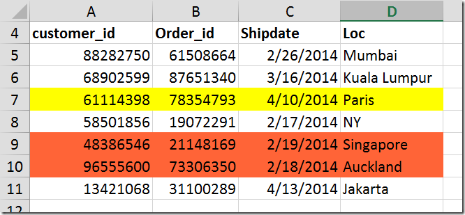
Example: Order shipment data. Four columns. Lot of color coding.
What does the color (formatting) mean?
Unfortunately, that question can only be answered by the person who added the color. While I conduct efficiency optimization sessions for customers, I come across this type of data every day.
The answers are very interesting. In this case it could mean Yellow means verified, Green means nothing – someone added the color – nobody knows what it means – but everyone is scared to remove it because they think it must mean something to someone…
It can get worse…
To make matters worse, if the color used is a THEME color (instead of STANDARD color), then the color itself may change if pasted into another workbook!
Here is the same data pasted into another workbook which is using a different theme. Yellow remained unchanged because it is a standard color. Green changed to Red because it is a Theme color.
Don’t know what is a Theme? Don’t worry. Read this article Understanding Office Themes.
The worst is not over yet…
Imagine what you have to do when the status changes… for multiple rows. In a dynamic scenario, this is bound to happen. You have to manually search / sort rows by color and change the colors again and again.
Sounds like YOU are helping Excel, instead of Excel helping you – which is a benchmark of inefficient methodology
Do you understand the problem?
The problem is that we are trying to describe something without words. We are using formatting to describe it – which is dangerous because others will not understand it.
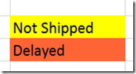
The solution may be that you create a legend like this… but that is extra work.
Finally, if you want to filter, sort, analyze, subtotal, pivot only the shipped ones, you will have to manually select the rows. None of these options work by color. Of course there is a Move Selected color to top option in sorting. But imagine using it for multiple colors and counting the rows by hand…
We are using color (or some other formatting) to indicate a meaning or information.
This is what I call Bad data.
The solution
Add a column and type the information which you were otherwise trying to communicate through formatting.
Formatting is NOT a substitute for data
Here is a better way to show the same data.
Now, the data is self-explanatory and will be understood exactly the same way by everyone. No ambiguity. In our language – this is GOOD DATA
but I still want to highlight the row…
This is a genuine requirement. Having put the status column clearly, we still want to visually identify the rows which are delayed or shipped. How do we do that?
The answer is Conditional Formatting. Using conditional formatting – Formula – it is possible to have the entire row colored based upon the value of one column.
This was covered in the previous article – How to highlight entire row based upon value in a single column. Read it NOW. Enjoy!
What next
- Start noticing and identifying files which suffer from this problem.
- Go back to the data, add one or more columns and repair the problem
- Use conditional formatting to highlight the data is it is really required
- Educate your colleagues and friends about this by sharing this article
- While creating / capturing new data, think of additional columns which you may need in future and incorporate them up-front
More worst practices and data clean-up
Read these articles to understand how to convert bad to good data…
Good Data vs. Bad Data: How to identify?
Analyzing badly captured survey data
Bad Data to Good Data: Pivot Copy Paste
Bad Data to Good Data: Filling in gaps using Power Query
Data Clean-up: System Reports
Data Clean up using Flash Fill (In-Depth)


