Pareto chart is used to analyze important factors and prioritize action items. It is a combination of bar and line chart. Bar chart shows the data in descending order of importance and line chart shows cumulative percentage. It is popularly known as the 80:20 rule. We will see three ways of creating this chart using Excel.

Contents
The Data
Download this sample file and follow along.
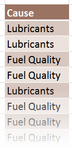
The data is a single column of 100 observations. This is automobile complaints data – the cause of Car malfunction.
We could use any data here which contains qualitative information. For example, manufacturing defects, types of fraud, products sold, location based sale and so on. In this case there is no numeric column. Therefore, the number will be the count for each cause.
But if required, a separate numeric column can also be used.
For example, location and quantity sold, BOM and qty consumed.
Structure of Pareto
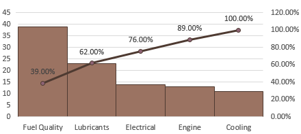
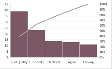
It is a bar chart with a line chart. Bar chart shows the number (count, sum, etc.) in descending order by the item being investigated (in this case the Cause). The left side Y axis shows this number.
The Line chart shows the cumulative percentage of contribution for each Cause. The right side Y axis (Secondary Y axis) shows percentages from zero to 100 for interpreting this line.
You can see that majority of problems are associated with the first two causes: Fuel Quality and Lubricants.
Creating a Pareto Chart with Pivot Table
Depending upon the version of Excel, steps required will reduce. I will show you the Excel 2013 version functionality.
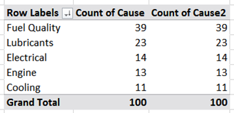
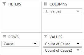
Create a Pivot table. We have only one column. Drag drop Cause into Row area once and Data Area twice. Both data area columns will show the count at this stage.
Right click in the first count column and choose Sort – Largest to Smallest.
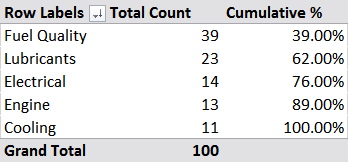
Now it is time to calculate the cumulative percentage. This is a two step process. Calculate a running total and then covert it to percentage.
Running total can be calculated in Excel 2007 and 2010. Right click in the second count column – Show values as – Running Total In. A dialog will appear showing the field for running total – which in this case will be Cause. Click Ok. The percentages will have to be calculated by you manually.
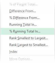
In case of Excel 2013, right click in the second column – and choose
Show Values As – % Running Total in (click ok when Cause is shown). That’s it.
Now draw a pivot chart if you are using Excel 2013. For older versions draw a regular charts with these three columns (as the last column will be manually calculated and outside the Pivot Table).
Combo Chart
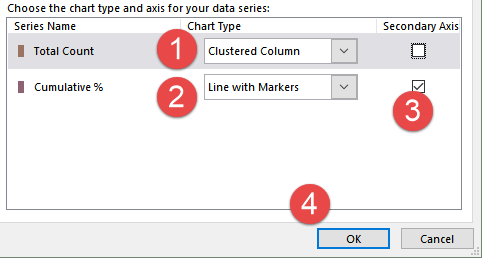
Choose a Combo Chart. This is a very useful chart type which is rarely noticed. Here you can specify the plot type BEFORE the chart is drawn. Specifying the secondary axis is also extremely easy.
Steps 1 and 2 are usually not required as these are the default types in this dialog. The selection of secondary axis in step 3 is important.
Customize the chart
- Reduce the gaps between bar charts to zero
- Put a thin border with a darker color around the bars so that they can still be differentiated visually
- Add data labels to the line chart to show cumulative percentage
- Customize the Secondary Y axis and make sure it ends at 100%
- Remove Primary Horizontal gridlines and enable Secondary Horizontal Gridlines
This is because we want to focus on the cumulative percentage. - If you use Pareto charts often, right click the chart and Save as Template for future reuse.
Excel 2016: Pareto Chart in one step!
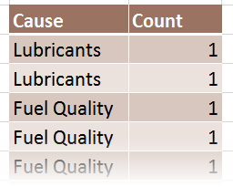
The new Pareto Chart DOES NOT depend upon Pivot Table. It works on raw data. Therefore, it requires two columns. First column we already have (Cause). You will have to add another column called Count and add the number ONE (1) to each row:
Now choose Insert – Pareto from the Statistical charts section and click OK. You get a perfectly formatted Pareto chart in one simple step!
Remember that this is NOT a COMBO chart. This is a special chart type called Pareto. The line is a special chart element called Pareto Line. Unfortunately, I could not find a method of showing data labels on top of it. I have posted it as a feature request to Microsoft already.
***

