Histogram is used to visualize the frequency with which data occurs. This is a good way of understanding data more than just sum and average. It is a good idea to look at each data set you get as a histogram. Here is how you do it in Excel.

Download this Sample File. Open it, look at the data and follow along. This file is intentionally saved in XLS format so that it can work with older versions of Excel.
Contents
The Need for Historgram
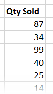
 Look at the data. It shows quantities of a product sold across different transactions. Simple analysis using Excel functions or Pivot table will show that the base summary:
But does it show which quantity range was sold more than others?
There were 100 transactions. Did each transaction happen near 48? We can answer that question by looking at more statistical functions like Mode (most commonly occurring quantity, 31 in this case) or Standard Deviation (deviation from the mean, 2.27 in this case). But these are still numbers. We need to see it visually to understand it better.
That is what a histogram is all about. It is a sort of “historical” diagram which uses vertically arranged things (like mast of a ship) to simplify understanding of data.
The concept
Take the range (10 to 100 in this case) and divide it into smaller pieces (called bins). here we can do it from 1o to 20, 21 to 30 and so on. Now count how many quantities fall into each bin and plot a simple column chart from it. That is the idea.
Excel has two ways to do this for you: using Data Analysis add-in and using Pivot Table.
Using Data Analysis ToolPak
Go to Data menu – Data Analysis option. If you do not see the option, activate the Add-in.
Choose Histogram from the available options. A new dialog opens. Select relevant things in the dialog and click Ok.

- The data range.
- Inform Excel that the data has a header (Qty Sold)
- Specify where the output of the histogram should go
- Force it to draw a chart
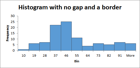
- All Done! This is what you get …
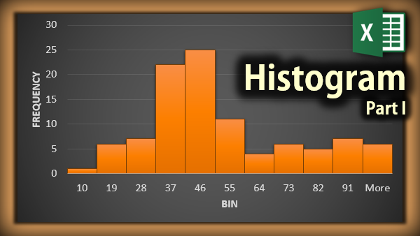
Notice that the frequency of 37 and 46 bars is highest.
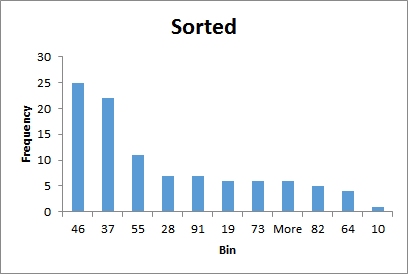
Sorted histogram shows the same chart and data but sorted in descending order of frequency.
This method helps us focus on the most frequent items more easily. If you reduce the gap between the bars, it looks like a traditional histogram.
In the next article, we will see how this can be done using Pivot Table features available in Excel 2013.
***


