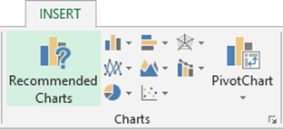
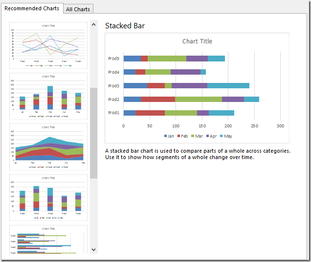
Lot has been written about it. With Excel 2013, Microsoft did the smartest thing. They added a chart type called Recommended Chart. Now Excel is smart enough to look at what data you have selected and choose the most appropriate chart types for you.

It shows the preview of those charts using YOUR data.
Final decision, of course, is yours. So you choose the one which depicts the information in the most relevant way. Also notice a feature called Recommended Pivot Tables.

The most important thing is to STOP using the habitually familiar chart and explore what recommendations are given by Excel. It is not about making the chart which someone is asking for.
It is about finding out every piece of useful information from available data and to use it to your advantage. By the way, that THOUGHT PROCESS is called Business Intelligence!
It is also a part of Quick Analysis feature (which we will cover in the next article).


