Please read the previous article first. Filters are not just for filtering. They also convey additional information. Very useful feature. Check this out.

Estimated reading time 10 min
Contents
Recap
- Slicer is like a filter but with more features
- Any column (field) can be a Slicer
- Slicer is a floating window where items can be selected or deselected for filtering
- One slicer can control multiple pivot tables
Download new file and follow along
Do not use the sample file provided with the earlier article. Download this file.
In the Sheet1, pivot tables, filters and slicers are already created.
Automatic Filter Synchronization
The first pivot table has traditional filter fields. Same fields are used as slicers.
Notice that any filtering done in filter area will synchronize with the slicer and vice versa.
Filtering can be frustrating
Ignore the Slicers for the time being. Focus on the Filter area of the first pivot table.
Segment is filtered to Banking. Now filter on Type of Sale – New Product sale
Now the pivot table goes blank. There is no data. There is not a single transaction where Segment is Banking and Type of Sale is New Product Sale.
This is a bad way of discovering that there is no data in this filter condition.
However, this was the only way available in earlier days. Now we have a better method available.
Filtering Filters
Make sure the filter is applied to Segment = Banking.
Remove the New Product Sale filter -Open the filter dropdown and choose All.
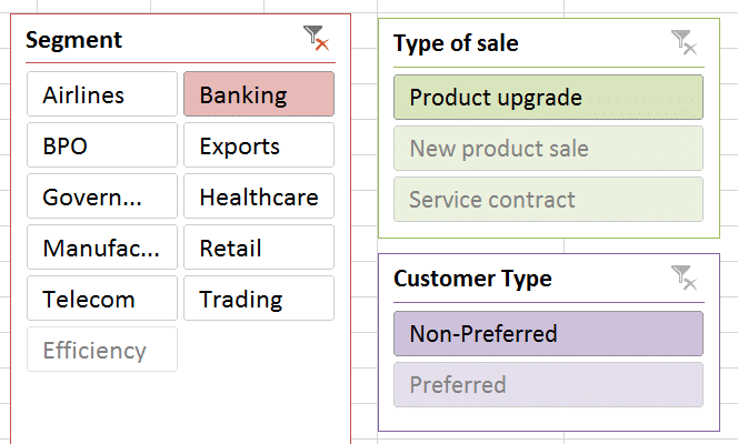
Look at the slicers. The Segment slicer shows the Banking filter.
The other two slicers show only those filter conditions where there is data.
Now, without having to click on non-existing filter conditions, you can VISUALLY see that there is no data under Segment – New Product Sales, Segment – Preferred Customers and so on.
This is useful analytical information – not just a convenience. It helps in knowing missing data upfront and that can be further correlated to understand nuances of the business context.
This type of filtering happens in all directions. Each filter can filter out unnecessary options in the other filter.
Mapping to business context: Example
Business Context: Preferred customers are those who have a long term and high volume sales relationship with your organization. Non-Preferred are regular customers who perform few transactions and / or the relationship is quite new.
Now looking at the slicers it is obvious there are no preferred customer in banking segment.
Why not? This answer Excel cannot give you. The answer to this question has to be found from the sales team. What could be the possibilities?
- We recently started focusing on Banking segment – in which case there is no problem.
- We have been doing business with Banking customers for a long time but there is no customer who has qualified for the Preferred category. Why not?
- Customers do not consider your organization as trustworthy enough to do more business
- The sales team is not making an effort to increase the volume of business
- There are customers who should have been classified as Preferred, but nobody has noticed them and elevated their status.
You got the point. Right?
Customizing Slicers
Click on the title of the slicer. Now a new ribbon tab appears Slicer Tools. This ribbon has many useful options.
Multiple slicers can be added. Therefore, aligning and grouping them is also possible. The look and feel can be changed to match the design of the pivot table.
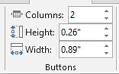
If the slicer field has too many items, try using columns.

More options are available under Slicer Settings.
Notice that custom lists can also be used for sorting. Don’t what that is? We will cover those in the next article.
Look at the three options which control the display of items which have no data in them. As we saw earlier, the item remains visible but the can not be selected. This is a nice way of showing that the data is missing.
Another option available is to just hide the items which are not available in the current context. This reduces clutter and simplifies the display. However, it may mislead the users into thinking that there are only few items available (those which are visible).
Size and Properties
Like any shape or image added in Excel, Slicers also have size and property settings. Right click on the slicer and choose Size and Properties…
These options are useful for adjusting the behavior of the slicer. Locking and printing control is also available.
Slicers work with SharePoint
When the Excel file is published on a SharePoint site, the sheet displays itself on a browser page. Even on the browser page, slicers will be visible and work as expected.
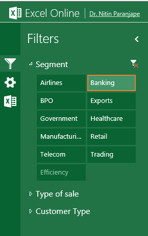
If only specific pivots or pivot charts are selected for display, the slicers will be automatically adjusted in a very useful layout. Here is how these three slicers would render on the SharePoint site (Excel Online). Only one slicer can be open at a time.
For details about how to publish Excel reports on SharePoint, read these articles:
New, Improved way of delivering Excel reports: Part 1 , Part 2, Part 3
***


2 Responses
This is a nice article, I never used slicer before. will try to re-visit the reports that I created (and used VBA to synchronize the pivot filtering) and upgrade those reports.
Hi Amulya
Yes, that is the right way. Take existing reports and retrofit them with new features.
Not just for learning the feature – but to get additional insights – which are valuable.
Lot of VBA and Offset(), Indirect() formulas or Control Toolbox items can be eliminated by using Pivot Table. Power View gives even more flexibility. I will cover it in a separate series of articles about dashboards.