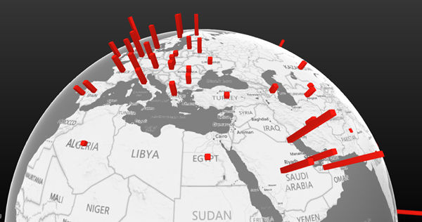
It is now possible to create interactive 3D maps from your data right within Excel.
Power Map is a part of Power BI series of tools. It is free, powerful and wonderful.

Let us dive into it and see how it can transform the way we understand information.
Contents
The overall picture
Data analysis is undergoing a dramatic change due to new tools and a renewed interest in the field. Of course, the good old Pivot Table, Conditional Formatting and Charts are very much alive. But the new tools provide new capabilities. Read these articles to get an overview of these new tools – all of which work in Excel.
Working with Excel data? There is a revolution happening. Learn Power BI
Combine Multiple Sheets into One Sheet (using Power Query)
DO NOT copy paste data from browser. Use Power Query.
Crosstab data consolidation using Power Query
Analyzing badly captured survey data
Facebook analytics using Excel 2013 Power Query: Without programming!
Prerequisites
You will need Office 2010 Professional Plus or above.
Check which version of Office you have.
Download and Install Power Map add-in from here.
Sample data
Use this file to follow along this article. The map is NOT included in the file. Only the raw data is included. The data is about per capita Oil consumption for various countries across many years. We will try to visualize this data using Power Map.
Creating a map from data
If you have some geographic information like country, state, city or longitude/ latitude, Excel can convert it to a map instantly. It uses Bing maps internally. Therefore you need an internet connection.
If you use Power View – it creates a 2D map like this (works only with Office 2013 Pro Plus). This has its own benefits. But we will focus on the 3D map capabilities of Power Map.
What does this involve? First of all, some part of data must have geographical information. This data must be converted to map locations. Now the next step is to find out what to show for each location – therefore we need some number to show. In this case we have per capita consumption of oil.
Step by Step
Open the data file, click inside the data and choose Insert – Power Map.
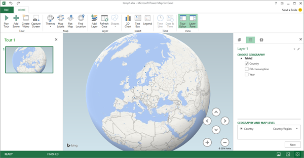
Depending upon the connection speed it may take a while to open the 3D map window. Initially it will show a globe with all the countries marked. It automatically understood that the country column contains data which can be plotted on the map.
For the time being close the Tour section on the left side. On the right side pane, it shows that Country is already selected. It is mapped to the geographical type Country/Region. Open that dropdown to see what else is understood as a geographical attribute.
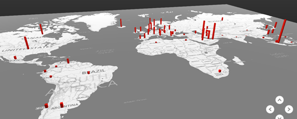
The next step is to plot our data. So click Next and choose the Per Capita Consumption field. Now each country will show a bar. Close the legend window so that you can see the globe clearly.
You can rotate the globe with mouse. Zoom in or out with Scroll Wheel or using the on screen buttons. It is also good to play with different perspective angles and get the feel of it.
Pressing Alt and dragging mouse in the map area gives you a free form 3D view transformation. Get used to it.
What is this showing? If you see the data, we have data for multiple years for each country. Right now it is showing the TOTAL of all the consumption numbers for all years for each country. Although this does not make much sense from the point of view of further analysis – at least you can understand how this mapping tool works.
We will refine this visualization soon. But in this article, let us just see how to tweak the view.
‘The bottom buttons !
Notice these three buttons at the bottom (status bar).
The left button brings the globe back into default view.
Add labels to make the map easier to read
Click on the Show labels option to view the labels. Depending upon the zoom level the labels will automatically adjust themselves. You can actually go to street level if required.
Themes
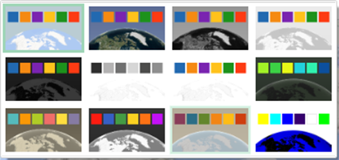
Open the Themes dropdown to see various color combinations. Click on each one to get the visual feel of how they look. It is not just for look and feel. Some are low contrast, some are high contrast. Some are more suitable for showing bar charts whereas some are more suitable for heat maps. As you learn more, keep experimenting with themes to find the most visually relevant one for the given context and data.
The globe shown earlier uses the theme Modern.
Geography detection errors
Sometimes, the names of countries, cities, etc. are not understood due to spelling mistakes, changed names or some other reasons. The accuracy with which the geography information was plotted is shown in the top right corner in the Layer Pane (right side window).
The first area (pencil icon) takes you back to step 1 so that you can choose a different geographical representation. In our case we have only one column containing country. However in real life data you will have Country, State, Region, District, City and so on. By going to the first step, you can change the granularity of the map plot.
The second item (95%) shows the accuracy of geo-coding ( the number of items the map has understood and plotted correctly). If you want to see which 5% were not understood, click on that link.
In this case it did not understand two abbreviations and the Hong Kong entry because it did not expect a comma in the name of a country. In such cases, you must go back to the data, make changes to the names as required and force Power Map to reinterpret the data by clicking the Refresh Data button.
Visualization settings
Click on the gear icon to see two types of options – Layer Options and Scene Options. Layer options control Color, thickness and height of the bars can be changed.
Scene options control the overall animation settings and transition time and effect. We will see what this means in a later article.

The same diagram looks like this with few changes to the Layer options.
Cannot see all countries – so flatten the world!
The data we have is for all countries. We can see only half of them at a time. No problem. Click on the Flatten option and it becomes a flat map with a beautiful animation.
Of course flat map has its own problem. It is a 3D perspective kind of map. So if you keep it absolutely like a top view, you cannot see the bars at all. If you keep in perspective mode, some countries will be near to you and some very far away. Therefore visual comparison of the various bars is always a bit tricky.
The idea is to find an overall view to show the global picture. But DO NOT use that view to form opinion about relative values of bars. To do a comparison, you must ZOOM IN. That reduces the distortion related ambiguity and lends itself to better visual comparisons.
Of course, hovering the mouse on any plotted element will show a helpful tooltip with the number shown clearly.
Let us plot average consumption
So far we are showing TOTAL consumption of average for each year by country. Which does not make any sense. Now let us find out the average consumption by country and plot it.
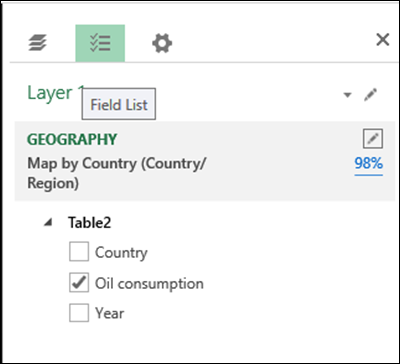
Click on the Field List button. Oil Consumption is selected.
Down below in the same pane, it shows that the aggregation is SUM. Open the drop down and choose Average.
Now notice that the same chart looks different as the average shows a different – and more useful picture of oil consumption.
This is the SUM plot
and this is the AVERAGE plot
Different ways of showing the numbers
This data can be shown in five different ways.
The first one is what we are seeing now. Simple bar chart.
The second one will show side-by-side bar charts in case there was a category. We will see categories later.
Third one is like a bubble chart.
The next one is a heat map. It takes into account the lowest and highest value and creates a color coding scale. To show the scale choose Legend button. (I have used the Black theme to show the color coding more vividly)
Finally, we have the Region visualization. This does not show the data, but it actually highlights each country and its boundary. The color given to each country will differ – depending upon the number associated with it (average oil consumption).
What Next
Now we know how to work with the geography data and numeric data. In the next article we will see how to work with categories.
***

