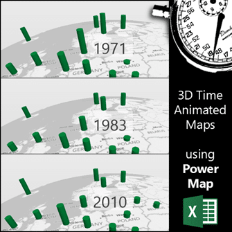
In this article we will explore how to use date or time values to visualize information in a completely new way.
Power Map uses the date or time information in the data to create an animated visualization which is out of the world! Have a look…
Read the previous article which shows how to create 3D maps from your data.
Instant, Interactive 3D mapping of your data – Power Map
Contents
Modified Data
We will use this data for the time series 3D animation. Data is similar to the earlier article. However, in the earlier file, the Year column was just a number. Power Map requires the column to be a date. So I have got the column converted to a date which is just the first date of that year. If you want a formula it could be =date(B1, 1, 1) assuming B1 contains a year.

Use this file to follow along. Choose Insert Map – Use Tour1 or create your own map. Download Sample File
Create the base 3D Power Map
Now we will create the Power Map as shown before. Click inside the table (data). Insert – Map. Make sure country is selected in the first step. Go to the Next step and then choose Oil Consumption. Change it from sum to average. Data is now plotted. This is what we did in the last article. I have changed the shape to cylindrical for the plotted bars, chosen a different theme (Aerial Color) and changed the default color to light yellow.
Now let us see what happens with the date column – I have still labeled it as Year.
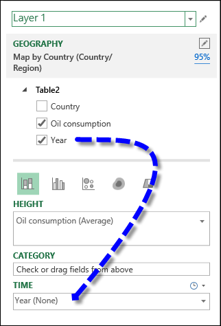
Drag that column and drop it into the Time area.
Now things change. Some date and time is shown on the map and you see a play button with a slider like control below. It picks the last date in the data. Now what does that mean? It is showing the average of oil consumption for that date.
This is a static image. Do not try to play it.
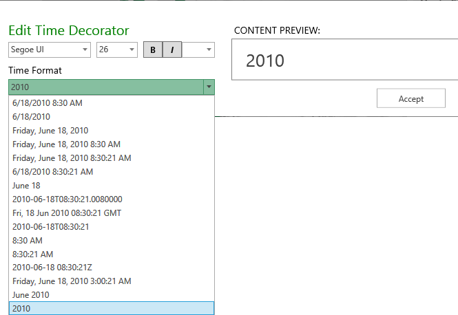
There is no time portion required nor the month because all are only years. Right clicking on the date time display allows you to change its appearance depending upon the data and the granularity you want to analyze at.
Earlier we have chosen Average function. Now we know that in this data, for every year and every country there is only one entry. Therefore the aggregation function does not matter in this case. However if you have data where there could be multiple entries for the same date, you must think and change the aggregation appropriately. Just for clarity, I am changing the aggregation to SUM.
Now let us click on the play button and see what happens. You can try this with any part of the globe. You can even rotate the globe while it is animating. I have chosen the Europe area because there are lots of countries near each other – making the animation very interesting to see. It is impressive. But we also need to make it informative
This is a video. Click on the play button.
[wpvideo w= 708 h=516 SKzdR0hn]
The animation looks nice but it is only impressive not informative at first glance.
To understand it better, you have to repeat it many times while focusing either on a single country or monitoring what happens relative to each other for two countries. Monitoring more than two may be difficult. While doing so, you must also be notice the current year. If you know evolution of each country historically, you may also be able to correlate oil consumption with key socio-political events.
Settings
There is a gear icon at the end of the play bar. Click on it to change settings.
You can change the overall scene duration. I have slowed it down to 15 seconds.
I also changed the Starting and Ending date to restrict the animation from 1996 to 2004. When these settings change, the Speed setting changes automatically. If you change the speed directly, the Duration setting will change accordingly. Increasing the speed reduces the duration. Speed basically indicates how much it will pause between each time unit.
Now click on the video below to play it and notice that it is now much easier to understand the changes as it is in slow motion. I have also increased the font size of the year display and positioned it right within the area of action so that eye does not have to keep shifting between the bars and the time.
This is a video, click on the play button.
[wpvideo w=706 h=544 R3v9eynv]
Bonus: Convert to video
If you want this whole animation to be exported to a video for sharing with colleagues, customers etc. just click the Create Video button. Choose the resolution and click create. We will cover this in greater detail later. It creates an MP4 file for the entire animation.
I created an HD video from Excel for the same visualization. MP4, 6.5 mb Download Video
What next
So far so good. But there is much more to this time playback than this. There are two ways in which we can see the playback – One is Manual where you move the slider yourself and the other one is automatic – which we just saw.
Under each of these, the way data is displayed is controlled by a special setting which is a bit difficult to understand. We will cover it in detail in the next article.
***


