How to keep the audience awake? That is the biggest problem we have while presenting. The less boredom you create, the higher is the chance of people being awake ![]()
Boring Slide Makeover: Screenshots from Excel explains how to make Excel data look better in PowerPoint. In this article we learn another technique to make small amount of summary data look better. Today I learnt a new additional technique to enhance the content even further.
This is not a detailed tutorial about using 3D effects in PowerPoint. This talks about a specific usage scenario which is quite common. For a nice and detailed tutorial on 3D shapes, lighting, fills and text read this article.
Please note that this article describes a Copy from Excel and Paste as Picture into PowerPoint scenario. However the graphics concepts explained here can apply to any picture or shape equally well.
Copy paste summary information from Excel to PowerPoint
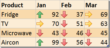
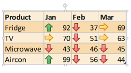
Here is a common need. I have this simple data below, which shows sales for different products for one quarter.
I have used Conditional Formatting to show the high, medium, low values. Read this article to find out how this is done.
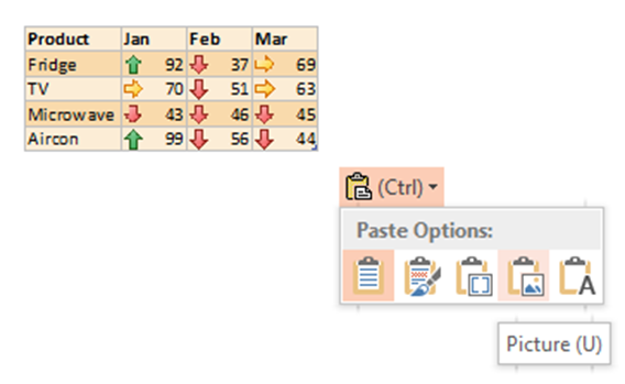
When you copy paste it into PowerPoint, it looks black and white (or some other combination depending upon your template).
Click on that icon (or press Ctrl ) and choose Picture (press U). Now you get what you want.
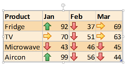
Resize it by dragging from the corner. Press CTRL key while dragging from the corner to maintain the center position. Finally it looks like this.
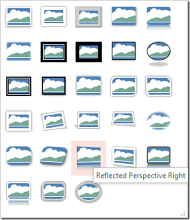
But we want it to look more stylish. Choose Picture Tools on top… Picture Styles Dropdown
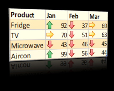
Choose the Style Reflected Perspective Right.
Now the same image looks more stylized. If the slide background is black or a dark color, the reflection will look even better.
There is only one problem. If you compare this image with the original one, you will notice that the color got faded and washed out.
Usually, I solved this problem by going to Corrections and changing the brightness and contrast. It works but I found a simpler method today.
Right click on the picture and choose Format Picture – go to 3D Format Settings and expand it. Now open the Lighting dropdown and change the light to Two Point as shown below.
The top left one is selected by default (Three Point light source).
Just change it to Two Point and now the colors look fine. You can play with different materials and lights to get an idea of how things change. It is useful in many other cases as well.
One last thing – which side is more important?
Look at the picture above. The product names are more prominent and the numbers are less prominent. It looks nice but it is giving less visual importance to something which is more important.
How do you solve the problem? This special effect is designed this way. It is used with photographs primarily. We are using it for data. So we have to tweak it. There is no ready to use left sided version of this. But no issues. We will do it ourselves.
Right click on the picture – Format Picture – 3 D rotation
Change these settings as shown. Actually you tweak and learn how these work.
Now you will get the other side looking more prominent.
That’s it. This is how you take ordinary looking data and enhance it in Excel first and then PowerPoint to communicate better and achieve a more professional looking impact.
***


