I received a query from a customer about dynamic data labels for charts. Instead of replying directly, I thought of writing this article. This will help all of you in refining your charts. The idea is to create a chart which explains the fluctuations using text based explanations. The best part is, the explanation can be a part of the data itself.
Watch the two minute video and read details below. This works with Excel 2013 onwards. I have also included the solution for older versions, which is not as elegant, but it works.
[youtube https://youtu.be/3WJ1WS_EQTE]
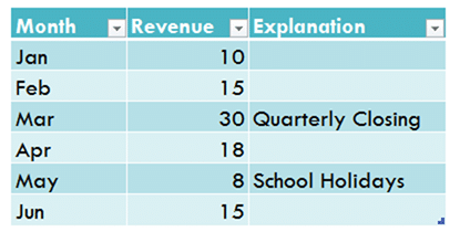
Base Data
Contents
Add data labels
Create a simple line chart while selecting the first two columns only. Now Add Regular Data Labels. Two ways to do it. Click on the Plus sign next to the chart and choose the Data Labels option.
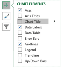
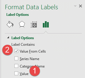
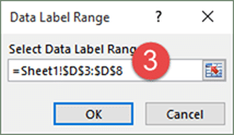
We do NOT want the data to be shown. To customize it, click on the arrow next to Data Labels and choose More Options … Unselect the Value option and select the Value from Cells option. Choose the third column (without the heading) as the range.
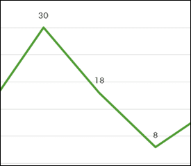
Now we have exactly what we want. Some labels may overlap the chart elements and they have a transparent background by default. We will repair those issues in the next steps.
Convert labels to callouts
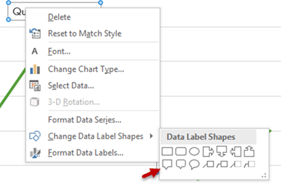
Right click on any data label and choose the callout shape from Change Data Label Shapes option.
Now adjust each data label as required to avoid overlap.

Put solid fill color in the labels
Finally, click on the chart (to deselect the currently selected label) and then click on a data label again (to select all data labels). Now choose any formatting options to adjust the fill and font color as desired. Please note that these are just shapes at heart. We can use all the fill options which apply to shapes including Picture Background, Patterns, Gradients, etc.
Here is a more stylized version of the same chart.
How to put it into practice?
Look at each chart you create and think if you can enhance its interpretation using Chart Labels. Of course, each component of the chart contributes to it’s interpretative value. Play with it till you get it right. The better the chart is, lesser you have to explain it.
Have an older version?
Here is the (lengthier) solution
- Create the chart as usual
- Add default data labels
- Click on each unwanted label (using slow double click) and delete it
- Select each item where you want the custom label one at a time
- Press F2 to move focus to the Formula editing box
- Type the equal to sign
- Now click on the cell which contains the appropriate label
- Press ENTER
- That’s it. Now that data label is linked to that cell.
- Changes to the cell content will reflect automatically.
- It works even if Paste Linked into PowerPoint (or any other tool which supports Paste Link)
In general, any chart item which can contain text or numbers can work with this formula method. The best way to find out if a particular item is editable is to select it (one item at a time) and press F2. If the cursor goes to the Formula Bar, that item can be linked to an external cell.



7 Responses
.Really interesting Sir… TY!
Great excel video! Effective and straight to the point. Much appreciated!
Thanks. More stuff coming soon… Doc.
Interesting. Need to see more
Great!
HI There
I am trying to create a combo chart with area (type) and line (type) selection and noticed the data labels are appearing in the middle of area and I am unable to move the data labels as there is no option available 🙁
Well… it is difficult me to visualize the exact problem. If you can put a screenshot, or send a sample file, I will be able to help. askdoc@maxoffice.co