Well, the histogram articles don’t seem to be ending. I promise, this is the last one. With Excel 2016, a new chart type called Histogram was introduced. Now we don’t need either Data Analysis ToolPak or Pivot Table to create a histogram. Have a look.

Download sample file and follow along.
Contents
New Chart Types: Statistical Charts
Excel 2016 has many new chart types. Histogram is one of them. Identify this button in the Insert tab.


Choose Histogram. The default chart looks like a histogram instantly. You don’t need to reduce the gap width and put a lighter border around the bars.

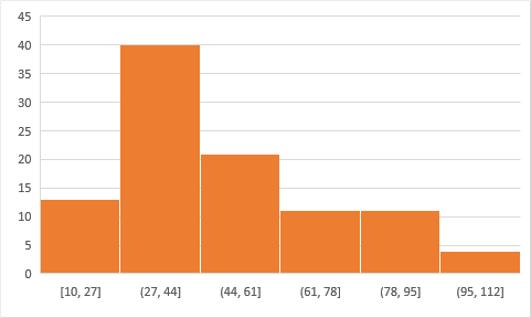
This is nice, but look at the X axis where the bins are shown. We know that our data is between 10 and 100. So we would have liked 10 bins of 10 each. But for some reason, it has created only 6 bins of 17 bin size.
How to customize the bins?
No problem. The first thought would be to go to Format Data Series. But you don’t see any customization there at all. You may almost think that these bins are hard-coded. But relax.
If you have been a reader of my blog long enough, or you have attended my sessions, you will know one important principle I teach: “The first thought which comes to mind while working on Office – is always wrong!”
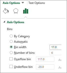
No worries. Right click on the X axis and look at Axis Options. That is where we can customize everything.
Notice that Bin Width and Number of Bins cannot be selected together. You type one of them and the other one is automatically calculated.
So let us type bin width as 10 and see what happens.
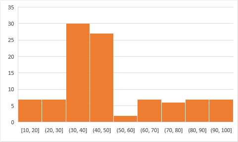
As expected, the chart was drawn with 10 bins of 10 each. How many bins to choose depends upon the data itself. You choose what is appropriate based upon the context.
Overflow and Underflow
If you want to limit the upper and lower value use the Over and Under flow options. Here I have set the values to 70 and 20. We know that we do have data which is above 70 and below 20.
That data gets plotted in a single category or bin. Even if I had data with a value of 545, it would still be considered under the >70 bin.
If you have 2016 version of Excel, start using this chart instead of using the other methods.
Is there another method available? Yes there is -using the online Power BI tool. But I will not cover it in this series. We will have a separate series for Power BI new features.
***


