With this article, I am starting a mini-series about Quality management tools. Fishbone diagram is drawn easily using paper and pencil. Here is how you do it using Microsoft Visio.

Photo credit: ro_buk [I’m not there] / Foter / CC BY-NC
Contents
The Quality Management Tools
The list is well known: Cause/Effect Diagram, Check Sheet, Control Charts, Histogram, Pareto Chart, Scatter Diagram and Stratification. We will cover all these 7 topics in this series.
Cause and Effect diagram
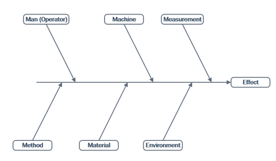
It is a simple diagram. The central horizontal line ends with the effect – which is usually a quality related problem. The issues are usually a result of one of more of causes related to people, equipment, methodology, material, environment or measurement. These lines are the “fishbone” of the diagram.
In simple terms, the concept is to look at ALL contributing factors relating to the problem and resolve them methodically.
Visio Step by Step
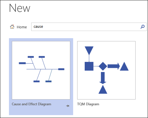
Visio offers a ready-to-use template and shapes for creating Cause and Effect diagram. File – New – type “cause” in the search box. Select the Cause and Effect diagram.

The other shapes are for primary and secondary causes with different orientations. First draw the Effect line. Then add category lines and then add primary and secondary causes.
I have created a simple Visio template with the effect and 6 categories. (Download zip file).
The template shows the effect line and contributing categories. Add the primary and secondary causes by drag dropping the relevant shapes from the Visio stencil.
Please note that in Visio we can have custom fields associated with each shape. This can lead to powerful new ways of using the visual diagram as a data capture and analytics mechanism. We will discuss some examples of data integration with Vision in a separate article.
The menus and the format of Visio I have used is version 2013. The UI may be different in earlier versions of Visio. However, the diagram has been available for many years. Just search for it in the right category under File – New – Business category.
***


