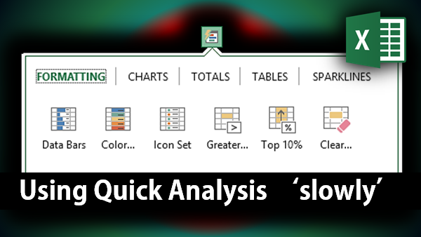
Read the previous article to understand the context of this article. Quick Analysis gives you many types of data visualizations instantly. But that is NOT the real benefit. The real benefit – as usual – is elusive and difficult to grasp in this “instant” mode of living life.

Read on to find out what you are missing – even if you know how to use Quick Analysis!
Contents
The objective of Quick Analysis feature
Even though it is obvious, let me restate what this feature does. It allows you to apply different forms of visual formatting to the SAME data – without the need to remove the previous formatting repeatedly.
So what? How will you use it in real-life?
Practical application
You get some data. The data is already summarized – often it will be a pivot table. Now you want to interpret it. Visually simplifying the interpretation process can now be easily achieved using Quick Analysis feature.
But now we have a different question to answer: There are so many different types of visualizations available. Which visualization will you use when?
Depends upon the data = Wrong Answer!
Most people say “I will look at the data and then decide which visualization is most suited for it”. That is – unfortunately – the wrong answer.
If you follow my blog regularly, you will not be surprised. You already know one of our cardinal rules of inefficiency: “The first thought which comes to our minds, while using Office tools, is usually inefficient.”
This thought is no exception. The correct answer is:
“ I will try ALL AVAILABLE VISUALIZATIONS which are relevant to the data and learn maximum possible useful information from it”
And that – dear reader – is the crux of this fashionable term called “Business Intelligence”.
Explanation
If you have already understood the why the right answer is right, you need not read this justification / explanation.
Quick Analysis shows the SAME data in different ways:
- Data bar – compare any value to any other value in a visual, ad-hoc manner
- Color scale – look at the overall distribution of values (better seen with larger number of values)
- Icon sets – classifies the data into 3 categories (or 4 or 5)
- Sparklines – show fluctuation across time or any other dimension
- Top 10% or Above a specific value (divides data into two categories)
- Different types of charts (visualizes in a graphical manner)
- Different pivot tables (summarizes data, applicable to tabular data only)
Now, notice that each type of visualization is going to give you DIFFERENT kind of information. Therefore, each type of visualization is useful. That is why you must try EACH visualization with each piece of data you get. It is in YOUR INTEREST to do so.
Of course, when you want to save the file and / or send it to someone else, you will be forced to choose ONE type of visualization. This time you choose the visualization which shows the most important finding (useful information) clearly. Other visualizations will need to be tried out by the other person viewing it.
Educating other users
This is where there is an awareness bottleneck. You have tried all visualizations and then the file is sent to someone else. That person just looks at the current visualization and does not even know that other visualizations are available. And in the process useful information becomes useless!
To avoid this, make sure everyone in your team reads these two articles.


One Response
Dear Doc,
This post simply rocks!