Photo credit: Donald Jusa / Foter / CC BY
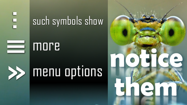
In today’s world of mobile phones and apps, finding options is becoming more and more difficult. These weird looking symbols have now become the default of showing menus with more options. I realized that many of us do not notice these symbols and therefore lose out on lots of nice features. Hence this article.
Contents
Why three dots …
The three dots you see in many apps have a very long history. Try this.
Right click on any cell in Excel and see the menu options.
Notice the option Delete…
Those three dots are called ellipsis.
![SNAGHTML6fe831[4] 3 dots](https://5ecacaf0.delivery.rocketcdn.me/wp-content/uploads/2015/03/snaghtml6fe8314.png)
Ellipsis indicate that something is incomplete. In this case, it indicates that choosing the delete button is not enough. You need to specify additional information – what to delete.
Also notice that Cut and Copy do not have ellipsis – because there is enough information available about what to copy or cut (current selection).

Now right click on a column header. Notice that the Delete option does NOT have ellipsis.
Why? Because it is already clear as to what is being deleted (selected column).
This concept of ellipsis is now extended in the user interface of mobile phones, tablets and many web applications (for example, SharePoint).
Why are these ellipsis vertical?
See the new avatar or ellipsis in mobile applications. It is vertical rather than horizontal.
Why so? Because computer screens and tablets have more width whereas mobile phone orientation forces it to have less width.
Many ellipsis
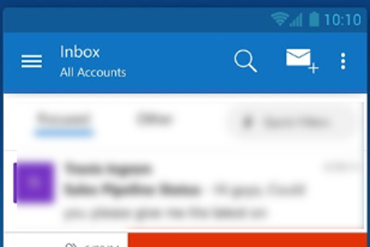
Here is a new visual which is used by Office 365 – this indicates “lots of options”!
Opening it shows you these options
Three horizontal lines
This type of visualization also indicates more menu options.
The difference is – the horizontal lines usually indicate menu options across the application. The ellipsis (vertical or horizontal) indicate menu options specific to currently displayed screen.
>> means show more options
This is another way in which some web applications may show existence of more options. Usually utilized when there is a whole sliding dialog (called a Pane) is to be expanded.
Outlook web access uses this type of indicator to hide or show folder list.
Invisible options
As though this was not ambiguous and confusing enough, there are options which are COMPLETELY hidden. How to unhide them? Slide from sides. I will cover this in another article.
Conclusion
Anything shown on the screen which does not make sense should be touched or clicked upon because – invariably – it will expose something more.
Unfortunately, there is no standardization across platforms and applications. We just have to try our luck. Of course it is counter-productive and pathetic in terms of user interface design. But nowadays, such things are called cool and awesome…


