This is a common mindset. When a button called Options is seen, we never click on it.

Here is what you are missing by ignoring such buttons.
Estimated reading time 12 min
Contents
Options means more sophistication
Whenever we use some feature, the default behavior is applied. That is why options are given. These options help you customize things to suit your needs.
Unfortunately, we rarely click on Option buttons ![]()
To illustrate what you are missing by NOT clicking on options, I thought of continuing the PowerPoint Transitions topic. In order to follow this article, you must do the exercise mentioned in the previous article:
Learning to Learn: Building a Visual Vocabulary – PowerPoint Transitions
Assuming you have read the article, you are already aware of the variety and sophistication available in various types of transitions. Which is a very good thing. You have built the “Visual Vocabulary” already.
Now let us explore the Option button.
Transition Options
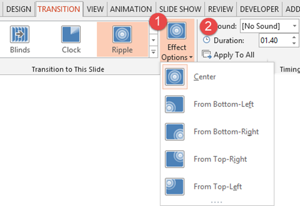
Whenever you choose any transition, the Effect Options button is available. Which is usually unnoticed.
While some options are predictable – all are NOT. That is where there is untapped potential. Consider the ripple function. Usually ripple starts from Center – the default option. But you can also start the ripple from four corners… hmm.. interesting!
Now that you know this, you will use it – if an when relevant. Also notice that there is a duration option right next to it. Changing the duration of the transition can dramatically change the visual impact.
I am not asking you to TRY each option and fiddle around with timings every time. But it is important to KNOW (be aware) as to what the options are.
Here are some interesting options.
Directional options
Most effects which have some directionality involved will have Left, Right, Top, Bottom and Corner options – if relevant. For example Wipe has all these options.
But Push, Cube, Box, effect has only right, left, top and bottom. Pushing diagonally does not make sense.
Effects like Fall, Drape, Wind, Peel Off, and many more have Right and Left as options.
Comb and Doors have vertical and horizontal options.
Fade Through Black
We use Fade transition often. Usually when the fade is mid-way, the previous and the next slide are seen in a semi-transparent state. In most cases this may be good enough. But there is another option called Fade Through Black. Here the previous slide fades out to black and the next slide fades in from black. This gives a cleaner transition.
When do we use this? When the context is such that the previous is completely eliminated and the new context comes up afresh.
For example, you want to show screenshots of your product. Each screenshot has nothing to do with the next one – these are just different features. This is best illustrated using Fade through black option. Intervening black clears people’s mind from the previous visual. Even in movies or on television you will remember having seen a quickly edited collection of shots – typically flashbacks – with fade to black being used.
Different types of Shred
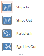
Shred is a good effect when you are asking the audience to forcibly remove some thought, bad habit, undesirable behavior, inefficient process and so on. It has some interesting options.
Consider these two slides with a Shred transition in between.
Compare the Strips In (left side) with Particles In (right side)

Try it out live. The Particle In looks outstanding!
Wedge option for Clock effect
There is clockwise and counterclockwise. But another option called Wedge.
It applies the effect from both directions simultaneously.
Glitter
This transition can use two kinds of shapes: Honeycomb or Diamonds.

Zoom with Rotate
Apart from Zoom IN and Zoom OUT, there is also Zoom with Rotate – which is good when you want to show the next slide like a news flash.
Fly Through
Two visually beautiful options called In with Bounce and Out with Bounce. You need to see these to understand what BOUNCE means.
Showing a series of things
It could be series of products, pictures, thoughts, steps in a process. Whenever you want to show an array of things, there are many effects available. Try Ferris Wheel, Conveyer, Orbit and Gallery.
I find Gallery as the best option because it makes the background black and shows each slide with a nice reflection. Looks very professional and stylized. Like this…
Key learning
Look at options. Not just for transitions. But in every place where the button is available. Options means more sophistication and customization. For the next few days, force yourself to explore at least ONE options dropdown or dialog. Soon it will become a habit. This is a very easy way to learn – while you work.
*** Enjoy ***


One Response
i have started using ur ideas for my power point presentation.