 |
In this article, we will explore more benefits of using Power View in comparison with Pivot Table. Estimated reading time 12 min |
Contents
Recap
Read these articles first.
How to create 12 pie charts in 1 second
12 Pie Charts – Why not use Pivot Table
We saw how to create multiple pie charts with just one drag drop operation Power View.
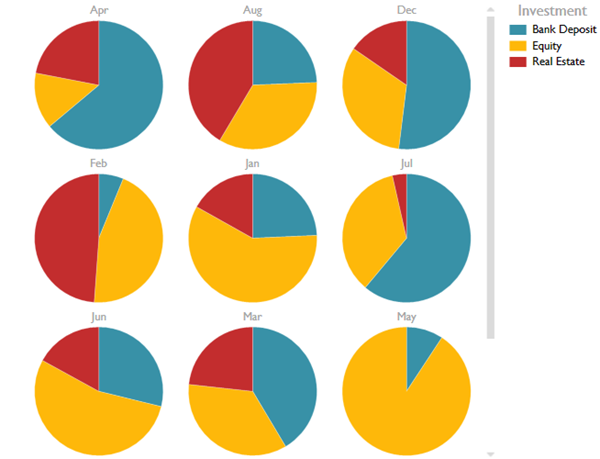
We also compared the equivalent method using Pivot Table. Pivot Table method is more time consuming and requires repetitive manual effort.
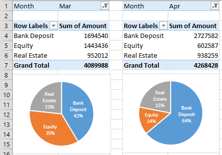
Using Power View we save lot of time which we can utilize to our advantage by analyzing the information in a more in-depth manner.
This article focuses on the benefits Power View offers over Pivot Table.
Remember that Power View requires Office 2013 Professional Plus or Office 2013 – Office 265 edition.
Download sample file
This file contains raw data, two pivot tables and one Power View dashboard.
Change chart type
I chose Pie chart in all these examples because there were only three items to show. However, suppose we wanted to use another chart type how would we do this?
Using Pivot Table
It would require you to change the chart type 12 times.
Using Power View
It just requires you to change the chart type ONCE.
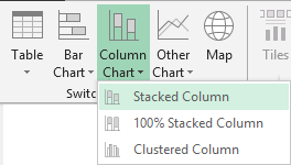
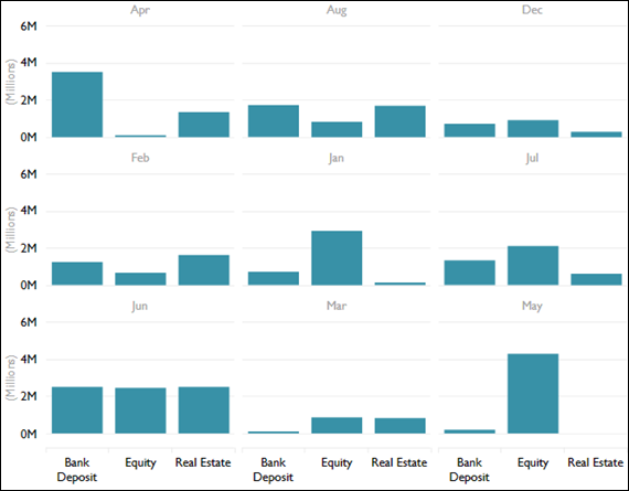
From the Design tab, choose another chart type – I have chosen Stacked Column Chart.
Instantly all the pie charts become column charts.
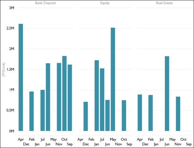
Notice that the SAME information was shown in both charts. But the fact that Equity investments were very high in May is more clearly visible in the column chart visualization.
So what is the benefit? You can choose the most suitable chart type quickly and derive useful information.
Axis is common
Pie charts have no axis. Therefore, each month was a full circle broken down into three pieces. But Column Chart has an X axis and a Y axis.
The titles for X axis are show only ONCE. If we had created 12 separate charts using 12 Pivot tables, we would have to spend lot of time arranging them together and manually hiding unwanted X axis labels.
The Y axis is even more important here. Power View found the maximum value across months and chose a common scale. It did not create a separate scale for each chart – which is what Pivot Table would have done.
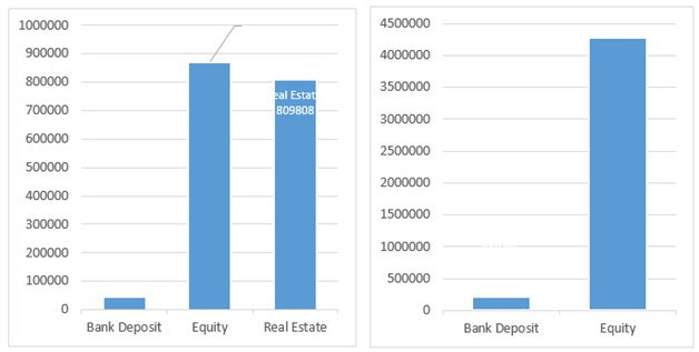
Here are two Pivot Charts for March and May.
Notice that the Y axis scale is different. This way, you will never see that the value of Equity in May (7,733,812) is much more than the value in March (1,443,436).
Showing the missing values
Missing items are not plotted by Pivot Charts by default. Power View, on the other hand, shows that there is no data for Real Estate in May. This absence of data is also a useful business insight.
The context will decide the choice of chart type
Although technically it is equally simple to create both type of charts, comparing contributions across multiple pie charts is visually more challenging than column charts.
Each type of data requires different type of visual charting to make the underlying useful information visible and easy to interpret.
Filtering on the amount
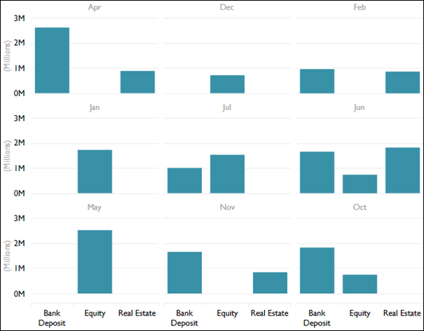
Let us see another benefit. Notice that we have plotted investment type and amount invested for 12 months.
Notice that we are taking all the transactions into account while drawing these charts.
If you see the amount column, you will notice that it covers a very wide range.
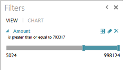
The minimum is 5,024 and maximum is 998,124.
Suppose we only want to analyze high-value investments. How would we go about doing this?
Pivot Table approach
Here we would have to first create a grouping by say 300,000 on the amount column. The add that grouped column as a filter. Finally choose the highest slab as the filter and see the result in the chart.
Of course, this has to be repeated 12 times – once for each month.
Even the thought of doing this manually is repelling!
Power View approach
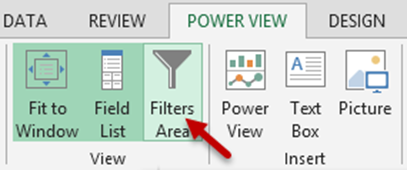
This is where Power View shines. There is a separate filter pane available.
(Why is there a Power View button inside Power View tab? Just for convenience. If you want to insert another Power View sheet, you can do it from here itself. No need to go to Insert tab just for that!)
Drag drop the amount column in the filter area. Notice that it automatically shows the minimum and maximum values in the column. Now drag the slider to approximately one third area towards the end. This will apply filter to the higher value transactions.
See what happened to the charts.
Instant Reshuffle
Now let us turn the data on its head. Let us put Investment type as a Vertical Multiple and Month as the axis in the Power View.
See the results. Quick and easy. Now I am not going to repeat the same story with Pivot Table approach. You got the idea.
There are many more advantages which I have not covered. We will see those in future articles.
Try Power View
Amazing stuff – is it not? And remember, all this is happening right within Excel. No special software to be purchased. If you have not tried it so far, get an evaluation copy and try it out.



2 Responses
Bother… I obviously don’t have the power view option or right software! Never mind I always enjoy you posts… question… I have a table in excel used/updated on a daily basis – what would cause it to go slow when sorted? will hidden columns do this? I’ve checked to make sure there are no rogue links, what else should I look for?
Cheers
Stella
Hi Stella
Check with your IT team if you have Excel Professional Plus edition. File – Account – About Excel will show the version.
If you DO have Excel 2013 professional plus and you still cannot see Power View, here is the article you should refer to..
About your file, it is difficult to provide a solution without seeing the file. How many rows and columns does it have? Does it have VLOOKUP or SUMIF type of formulas in it?
If possible, send me the file (or a part of it) on nitin@maxoffice.biz
Cheers.
Doc.