This article shows how to find difference from a specific value to other values in a Pivot Table. % Difference From is a very powerful way to understand your data more closely.
Try it out…

Estimated reading time 14 min
Contents
Recap
We are exploring the built-in capabilities of Pivot Tables. We saw how data can be converted to percentages and it can be shown in different ways. We also explored multi-level percentages using % of parent row total options.
Read these two articles to understand the background and maintain continuity:
Adding formulas OUTSIDE Pivot Tables = Inefficiency
Pivot Table – Show Values As – Part 2
Download Sample File
Download this file and follow along …
Changing the comparison benchmark
Till now, everything was compared to some kind of grand total – either for rows or columns or the whole data.
Now it is time to forget about the grand total and compare the data within itself.
Here is the base Pivot Table – Create a Pivot Table from the sample file.
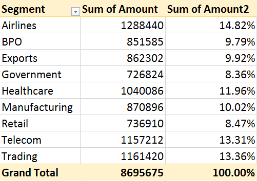
Drag Amount in Data area and Segment in Row area. Drag and drop Amount AGAIN in the column area. Right click in it – Show Values as – % of column total.
In the third column, each value is the contribution to the grand total.
Now we want to forget about the grand total and compare various segments to each other.
For example, let us take Healthcare as the base business (because that is our core strength or we started that business first or because we have maximum sales force in healthcare – or for some other reason)
From column 2, we can see that Healthcare contribution is lesser than Airlines contribution.
Airlines contribution – Healthcare contribution = Difference
1288440 – 1040086 = 248354
From column 3, the percentage difference in overall contribution is
14.82 % – 11.96% = 2.86%
But these percentages are misleading because the contribution numbers are not dependent on Airlines and Healthcare numbers alone. Those depend on all other numbers as well. This is preventing us from comparing Airline with Healthcare.
How much bigger is the Airlines business compared to Healthcare business?
That is the question we want to answer.
This answer does not depend upon grand total. It depends only on the actual difference between the two values – which is 248354 as we just saw.
This calculation will need to be done for all segments Government – Healthcare, BPO – Healthcare and so on. Lot of manual work. But if done, it is useful.
That is why Pivot Table provides a very useful option called Difference From…
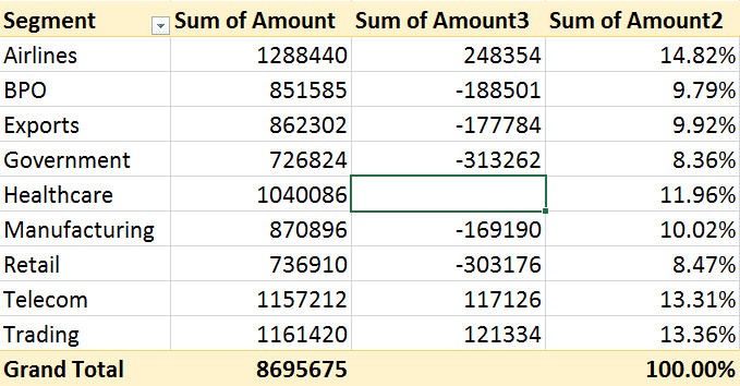
Add amount column again in between the second and third column. Now first two columns show raw amount totals for each segment.
Now click in the cell of second column – healthcare because we want that to be our base value – our comparison benchmark. Now right click there and choose Show Values As – Difference From…
A dialog will appear asking you “difference from what?”. It will show the Field as Segment and Item as Healthcare – which is what we want. So click Ok.
Now we get to see a totally different picture about the SAME data in column 2.
Pivot Table took the value of each segment and subtracted the Healthcare value from it. The difference is shown. Very nice. But it is a bit confusing because these are again long numbers.
Interpreting is always easier with percentages rather than actual values. So how do we show this data as percentage? Notice that in column 2, there is no Grand Total because we are NOT trying to total anything here.
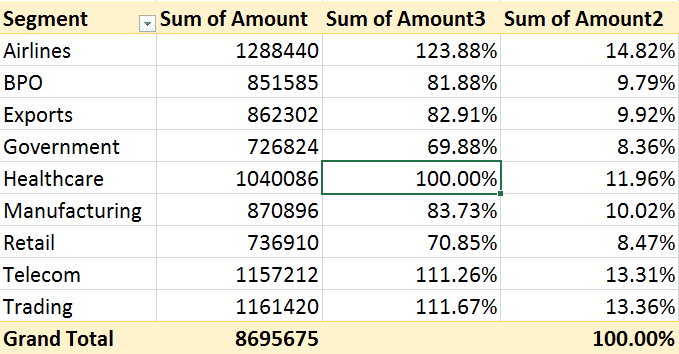
What if we take the value of Healthcare as 100% and recalculate all other values accordingly? That is called % Of… Try it and you get this.
Much better to interpret. Mathematically correct, but practically misleading.
Is Airlines business 123.88 % bigger than Healthcare? No. Let us find out.
Actual difference between the two would be 1288440 – 1040086 = 248354
If we want percentage difference then we will have to use this formula
248354 / 1040086 = 23.88 %
Then why is it showing 123.88%? Because we asked it to consider Healthcare as 100% using the option % Of…
Why not ask Pivot to get rid of 100% from all values and focus only on the difference?
That is done using % difference from … option. Now we get this.
Much better, easy to interpret and understand the correlation.
You can change the benchmark to another segment and see it find % difference from it. This shows the SAME data but with Exports business as the base for comparison.
This way, we are getting a very different picture of the same data. New useful information. Airlines is almost 50% of Exports, retail is much lower and Trading is also a good option.
Can be make this interpretation even easier? Of course. We can sort it on column 2. Right click in the second data column and Sort in descending order.
Even easier to interpret. But the width of many items is similar – misleading our eyes into falsely thinking that these values are similar. We have to apply lot of mental processing to read each value and then compare them to each other.
Can we minimize this additional thinking? Yes.
Select data in that column – open Home Tab – Conditional Formatting dropdown – Data Bars – choose a color – use solid color (don’t choose gradient).
Now it is unimaginably better!! Remember to use Conditional Formatting with Pivot Tables to simplify data interpretation and visual correlation.
What did you learn?
Now that you know these features, are you not tempted to try this with your data? Do it immediately. It is not just a fashionable new trick. It is going to give you some very useful information which was hidden in the same pivot tables you have been creating for years.
You were so near it but still so far that you never understood it.
That is called a lost opportunity. Of course you will feel sad that you did not know this earlier. But that is not going to help you.
What IS going to help you is to start using it in every piece of analysis you do from now on. Even if the standard report does not expect you to do this analysis, you MUST do it. Because if you don’t, you are losing a chance to act on some useful insights.
What Next?
We will cover the remaining options available in Show Values As in the next article.
Update: Sep 12, 2016: I am working on a new course: Pivot Table – The second honeymoon. It will be my most comprehensive MOOC course to date with over 70 lectures and approx. 5 hours of lecture time. It will be launched by October 2016. Stay tuned for further announcements!
Articles in this series
Adding formulas OUTSIDE Pivot Tables = Inefficiency
Pivot Table – Show Values As – Part 2
Pivot : Show Values As – Part 3 (this article)
Pivot: Running Totals and Ranking
Adding calculations WITHIN Pivot Tables
The amazing Calculated Items in Pivot Tables
***


