Please read the earlier article Efficiency Test 4: Word. The challenge was to format Word tables in the most optimal way.
Here is the solution. You need a total of 10 clicks.
Reading time 10 min. (Why 10 minutes to understand 10 clicks? Because you are not just learning where to click. You are learning how to communicate with Word in a language it understands!)
Contents
Follow along the steps and learn more
Sample file for the test. Download and Open
The base table looks like this.

Challenge 1: Making row height same across the table
Different row heights make the table look imbalanced. All heights should be same as the tallest row.
Inefficient methods and why they are inefficient!
- Pressing Enter in each row containing only a single row of data
This is obviously repetitive, cumbersome and pathetic. Still many of us do this! - Selecting the entire table and then doing something
This is a natural reaction – we want the row height to change across table. But remember that Word is smarter than you think it is. You DO NOT need to select all rows to make Word understand that the WHOLE table needs to have same height. - Manually dragging the row separator lines one by one to increase height
This is a humanly impossible task. Don’t even try it. - Manually increasing the height from row height option in ribbon
This is also repetitive and you will waste a lot of time reaching the optimal height.
How did we know this was inefficient?
This is repetitive and looks like YOU are trying to help Word.
The right way – ask Word to do it for you
Remember, everything you need has already been observed by Microsoft. You just have to search for the solution.
First step: Just click inside the table – anywhere. This identifies the table.
Now you have to find the answer. There are two ways to find an answer – specific to a small area ( use Right Click) or global answer – for entire table.
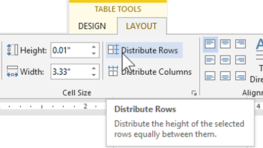
In this case it is a global answer – so we must look at the Table Tools ribbon. This is obviously a layout problem. So click on Layout. There is already a group of tools for modifying the cell size.
Most people do not notice the Distribute Rows option. Why? Because we get attracted to the Row height numeric setting. Always notice all buttons and see the tooltips of buttons you are not familiar with.
That solves the problem in ONE click. It looks at the tallest row and makes all other rows of the same size. As this option has to look at the entire table to decide which row is tallest and then change all other rows – you DO NOT need to select the table.
This is a one time setting. It is not dynamic.
This is a good option but it works on the data you have at the point of time of distributing rows. If you add more rows which are taller, this setting WILL NOT automatically increase the height. That means you must apply this setting after entering all the data (or most) and remember to increase the height when more data is added.
When NOT to use Distribute Rows
If it is a small table and the aesthetic appearance matters, use this option. However, if most rows are single phrases and only one row has too much height, using this option will waste a lot of space – making it look ugly and confusing.
It will also require more paper to print. So be careful.
If it is a large table and is cutting across pages, it is anyway impossible to view the entire table at a glance. In these cases the aesthetic advantage of uniform row heights is lost.
Challenge 2: Center the data in rows vertically
We used distribute rows option because some rows have less data and some have more. By default, the cell contents are aligned to the top of the cell. In this case we want them vertically in the center – but the horizontal alignment can continue to be left aligned.
Remember that this setting can potentially be applied to a cell, row(s) or column(s) or entire table. Therefore, Word cannot assume that you intend to apply it to the whole table.
That is why, before you apply this setting you must SELECT THE ENTIRE TABLE.
Fastest way to select the entire table?
If you can see the top left cell of the table, click on that small icon which appears nearby the corner.
But in most cases we are not so lucky. If it is a long table, we have to scroll repeatedly to find the first row. Bad idea!
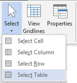
If you cant see the first row, here is the fastest way of selecting the table.
Table tools ribbon – Layout tab – left most option – Select – Select Table.
If you use this option often, right click on it and choose Add to quick access toolbar.
Change the vertical alignment to Center
This is easy. Click on the Align Center Left button in Layout tab.
Challenge 3: Use optimal width based upon content available
Most of us are tempted to do this by manually adjusting the column widths.
Remember – the first thought is usually inefficient.
Here again, Word is way ahead of your thought process. Just ask Word to do it for you.
It is a Word Processor – not a typewriter which depending upon you for every formatting decision.
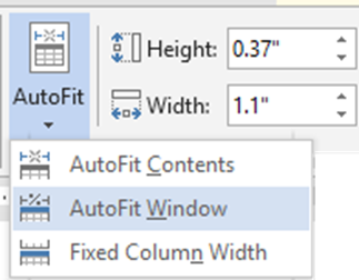
Layout – AutoFit dropdown – AutoFit to Contents
That solves all challenges. But there is more – as always!
AutoFit to Contents is irritating – it is a “live” setting
Unlike the Distribute rows and columns settings, AutoFit to contents setting is an active setting.
What does that mean?
Try typing a long sentence in a shorter width column after applying this setting. Notice that Word is constantly trying to readjust and optimize the column widths as you type. This can be very distracting and irritating.
How to stop AutoFit to Contents
Once you get optimal column widths – we need to tell Word to STOP AutoFit.
That is easily done using the third option in the AutoFit dropdown – Fixed Column Width.
The options are together for a reason – they are related. They work together to make your life easier.
Paradoxically, they way we usually work – we are trying various innovative methods to make our life more cumbersome and inefficient!
Now you know


