Till now we have seen various aspects of plotting geographical information.
How do you present this information to others? Often we want to show our plans in a step by step manner – going from one location / region to another.
This can be done using Power Map Tour.

Let us explore how this can be done.
Contents
Required Reading
Please read these articles in order to understand the concepts, prerequisites and operational details of how to use Power Map. At least read the first article if you have less time at hand.
Instant, Interactive 3D mapping of your data – Power Map
Uncover hidden secrets: 3D, Time Animated Map using Power Map
3D Map with Date/Time based animation: In-depth
3D map – Time Animation – Part 2
Using categories with 3D Map
The need
We usually analyze data using Excel (Pivots, Charts, Power View, etc.) and finally present it to your team, seniors, customers etc.
Power Map is another type of analysis. It is a 3D map. And usually if you show the entire globe, you can see only half of the world. Even if you convert it to a flat map, all countries / location cannot be shown in detail. There is only so much you can see when you zoom out to see the whole globe (or whatever is your area of interest – like country, state, etc.)
Overall picture is a good thing to show. But that is not the end – that is just the beginning. After showing the overall picture – you will need to go down to the details at a lower level of granularity.
For example, you may want to show the overall sales initially. And then drill down (Zoom In) at country or region level. The moment you go to a detail level, you can show only one item at a time. For example you start with northern region first and then move to south, east and west in that order.
Of course you can do this by manually by moving the globe around because Power Map is fully interactive. But during a presentation you want precise focus and you don’t want to spend time in zooming in or out, tilting or panning, changing color theme, modifying titles or legends and so on.
That is why there is a concept of tours. It is simple to understand but can lead to amazing and extremely useful visual demonstration of whatever you are trying to explain.
What is a tour?
When you create a Power Map (Insert – Power Map), you create a Tour automatically. You can create more if you like. But right now let us work with the default tour.
Each tour has steps or Scenes. First scene is already added when the tour is created. It is similar to how Word creates a section and then adds a page to the section while creating a new document.
You can add more scenes and customize them the way you want.
Finally you can run the tour in an automated manner – with full control over timing and using various visual special effects.
Creating a tour
This should be done AFTER you have analyzed the data, understood the interpretation and you are ready to create a “presentation” based upon the map.
Let us see how this is done. You can download this file to follow the steps shown below.
Example
Let us say we want to show the oil consumption across continents – one by one – in this order:
- Americas
- Europe
- Asia
- Africa
- Australia
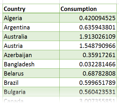
The data is simple. It shows countries and oil consumption details. For simplicity, I have removed the category and time columns. However, in real life, much more complex data can be handled easily.
First Scene
Click inside the data, Insert – Map and create a map. Countries will be plotted. Click Next and choose Consumption to plot the bars. Make sure that the Tour Editor and Layer Pane are visible.
Now notice that on the left side pane – the tour editor, you can see Tour1. Rename it to Global Oil Consumption.
Rotate the globe to show North and South America. Now we have one scene shown. Each scene has some options. Click on the Gear sign. Two kinds of settings are available. Layer Options and Scene Options.
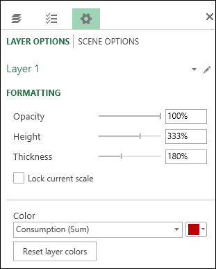
Click on Layer Options. North and South America occupies a lot of area. We need to make the bar plots visible. Therefore, change the values in layer options as shown. I have increased the height and thickness of the bar and chosen Red color. Enable Map labels as well.
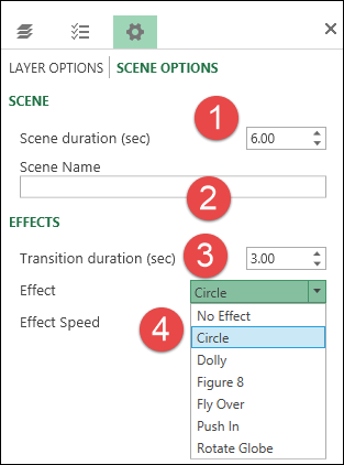
Now change the Scene Options. This is the first scene.
- Duration can be changed to make the scene stay as long as you want before it shows the next scene.
- Change the name to Americas
- Between two scenes you can have a transition. Default is none. But I have chosen duration of 3 seconds for the transition
- Select the transition Circle.
If you have time animation, you will see additional animation duration setting as well. In this case, we do not have a time column.
Now we are ready to play our 1 scene tour.
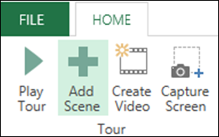
Click on Play Tour button in the ribbon to get the feel of how things work.
Now let us add the Europe Scene. Click on add scene button. Move the globe to view Europe. Change the zoom and tilt level as desired. Name the scene Europe.
Similarly, add more scenes for Asia, Africa and Australia. Change the globe position appropriately and name each scene. Scene order can be rearranged using simple drag drop in the Tour Editor window.
Run the tour and see how it works. I have modified the scene duration, transition time and type of effect for each scene. Transition time is used to smoothly fly from previous geographical region to the next scene geographical region.
Please note that during the tour you can pause and play at any point of time. Mouse hover shows tooltips to display details and numbers.
Convert to Video
This option is very useful for sharing the presentation with others who do not have Power Map. It converts the entire tour to a single MP4 file.
You can also embed the MP4 file into your PowerPoint presentation or any other multimedia output.
You can choose the resolution depending upon your needs. I suggest that initially you create few videos in different resolutions and try them out. Usually Medium resolution is good enough for regular presentations. For broadcast quality output, choose HD resolution. The lowest resolution will be ok for mobile devices. However you will see some loss of visual clarity – while benefiting from small file size.
Here is the entire presentation shown as MP4 file. To reduce the download size, I have created this video in low resolution. Still it is a 12 mb file. Whereas the Excel file containing the data as well as the entire tour is just 220 KB. Therefore, it makes sense to ensure everyone has Power Map installed so that they can create as well as share the map based visualization without the need to transfer bulky video files.
Click the play button to view the video (26 seconds). View in Full Screen mode.
[wpvideo w=600 4I6MDGSF]
If you are delivering the video to someone for separate viewing or posting it on intranet or Yammer, make sure you add some background music. This is a very nice feature to have because in the absence of someone to explain what is happening, a long video may be boring to watch. Music makes it more interesting.
Try it yourself
This file contains the data as well as the Tour. Download it and click on Insert – Power Map. It will show you that there is already one tour Global Oil Consumption available. Open it and learn how this was done.
Once you learn the stuff, close the tour, go to Power Map again and choose New Tour and create one yourself.
Finally try this with your data and impress your colleagues during your next presentation.
Note for IT team
You may not have Power Map Add-In installed. IT may not have given individual user permission to install external add-ins. Please approach them and request them to install it for you. If you find it useful, request it for your entire team, department or organization.
If the IT team asks for a business justification for installing Power Map, tell them to read these articles. Better still, if you have created any Power Map reports using your data, show it to them and impress upon them the additional business benefits of having this new and revolutionary tool for data analysis.
Worst case, refer them to me – nitin@maxoffice.biz
***


