Power Map series article 3. We will explore how to plot and interpret date/time type of information visually on the 3D map. This type of visualization is new to most of us.Therefore, this article clarifies the core concepts by taking a very simple example.

Read on to sharpen your analytical skills.
Contents
Required Reading
This is the third article in the series on Power Map. Please read these two articles before reading this one. Recap of the earlier articles is NOT included in this article.
Understanding Time Animation
Earlier we used the default animation by year and then slowed it down to reduce the speed. However, in the animation is only the first step towards understanding the information at a gross level. It gives you a good overall picture. Fair enough. Now you will want to know more details… for example, consider these questions.
Did the number of chest injuries reduce after seat belt was made mandatory?

Did the consumption of Oil increase or decrease after the Berlin wall was broken down?
Did the new promotion increase the footfall in the superstore?
Manual Playback
We continue with the Power Map tour created in the previous exercise for now.
In order to understand specific deviations from each time zone, you need to do two things. First of all – get the granularity of time zone correct and Secondly move the time manually to get a better picture.
Change the data-time granularity
In our case the data is yearly and the date column is also called Year. Just to avoid that confusion, I am going to rename the column to Date Time in the raw data and refresh the Power Map.
Now in the time option – Open the Dropdown and see the options available…
If you had data with detailed date time information, you could choose to see it at different levels of granularity. Notice that if there are multiple entries for the same year (or chosen period), the numeric data (consumption in this case) will be aggregated as shown in the Height area above. We are using the average of Oil Consumption because it is a per capita per year number.
If on the other hand, the Oil Consumption data was the actual total consumption, we should be considering the SUM rather than average for period based aggregation.
Move the slider and see the impact manually
Now that everything is setup, DO NOT click on the Play button. Instead, you move the slider to area of your interest in the timeline and observe how it affects the plotted values.
You can go back and forth, move slow or fast or move one step at a time – it is fully under your control.
Spend time on this to learn it well. I strongly suggest that you get some transactional data with date time stamps, create a Power Map with time animation and play with it. Use data whose fluctuations you already know – some well known historical data. This way you are trying to discover what you already know. Such an exercise will help you understand which type of interactivity to use to unearth useful information.
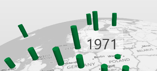
Here are three screenshots of oil consumption in different years.
How is the data plotted?
In all the above cases, there is only one entry per country for each year. Therefore, whether we used sum or average does not really matter. It is just the current value for the year being shown.
But while animating data with Date Time values, there are three different options available which decide how the data is plotted.
Till now what we were seeing is the option Data stays until it is replaced. All three options are available if you choose Sum as the aggregation. However if you choose average, the second option, Data accumulates over time, is not available. (Obviously, average is an average – it does not really “accumulate” in the true sense of the word).
Understanding these three options is very important because it is a very powerful way of finding out useful information from the data – which is impossible to find using any other method.
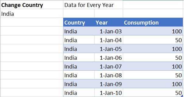
In order to learn how these three methods work, we will have to use a different set of data. Here I am taking only one country with very few rows of simple data. Note that now the consumption column contains ACTUAL consumption – not per capita. Therefore, it is ok to use SUM aggregation.
Of course you would like to see your own country plotted Just change the country name in A2 and it will change everywhere. If you have already created a Power Map, you will need to refresh it.
For sum aggregation (which is the default), the standard accumulation method is Data Accumulates Over Time.
Let us see how this works. Click on the play button to see for yourself. I have slowed down the animation so that you understand what is happening.
[wpvideo w=440 h=416 QkRzHEYT]
Now let us try the same thing with the other option Data Shows for an Instant. Look at the data and then play the video and correlate what is happening each year.
[wpvideo w=434 h=394 ydZ1T3oH]
In this case only the current year data is shown. There is no accumulation or summation across time. What you see is the value for that year (or whatever time period you have chosen). As each year changes, the bar starts from zero and animates to full height – which in this case is either 100 or 50. You can pause the animation at any point and see the tooltip to understand the current value.
Now let us try the last option Data stays until replaced. Note that data has not changed. Play this video and see the visual difference. Compare it visually with the previous video.
[wpvideo w=440 h=412 uOZFxOgF]
What did you observe? Here each bar does not start from zero (baseline). It looks at the current value and adjusts to that. If the previous value was 50 and current year is 100, the bar grows from 50 (not from zero). Similarly it shrinks from the higher value to the current lower value.
It is very similar to the earlier video but there is a very crucial visual benefit here. The fluctuation clearly shows the growth or decline from the previous value. This was not easily seen when the setting was Data Shows for an Instant.
What next
Try this with your data and various options for aggregation, time unit and time animation options. Some practice is required to choose the right combination in your data context.
I though I will finish the Power Map series with this article. But there is so much more to cover. So I will continue this series for a few more articles. We have to cover more details about Data Stays until Replaced. We also have to see different type of visualizations and which one to use when. Then there are multiple layer scenarios. And finally we see how to create a Tour with multiple scenes.

 (
(


