Please read the article Show Off Demo: Create new shapes in PowerPoint first. This is the second article in the series.
Let us explore the merging options in greater detail. This article is based upon PowerPoint 2013 capabilities.

Contents
I already know how to merge shapes. What more can I do?
Good question. The good news is that, since 2013 version, you are not limited to shapes. You can merge text and images as well (no. Not videos!).
That may not sound like much. But if you really like to see the impact, read this article Show Off Demo: Create new shapes in PowerPoint and download the presentation and see for yourself.
Remember, merge shapes should actually be called Merge Objects. But there is one simple requirement. Text, Shapes and Images can be merged with each other in any combination.
Follow along sample file
How to draw custom shapes?
This is available since 2 decades. Go to Insert Shapes and choose freeform or scribble and you can draw any shape. You can refine it using Edit Points on Drawing Toolbar.
I suggest you understand how to use both type of shapes and also try editing points to get a feel of how it happens. When you scribble and use edit points, you may need to reduce the points. Right click on any point to either delete it or change its behavior. I will write another article for that. But for now, let us focus on merge shapes.
Let us create this logo – Jet Airways.

Here is a simple oval and another freeform shape. Oval is tilted slightly.
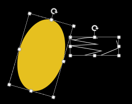
The shape of the freeform matters. The color does not matter because it is going to be subtracted.
Now overlap both shapes. Use Edit Points (right click on the freeform) and adjust so that the alignment is perfect.
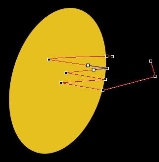
Choose the Oval first then the freeform. The order of selection matters. Then select Merge Shapes – Subtract. That’s it. Of course, it is not perfect. But good enough to learn Merge Shapes

Next time you are going to a customer and you want to impress them, and their logo is simple enough, try creating it in front of them. They will love it. (Don’t try it with complex logos like Starbucks or Unilever!)
If you compare this logo with the original, the edges of the two spikes protrude beyond the oval margins. Now you know what to do … Edit shapes again- remember, this is a regular shape now!

Knowledge is power
What can you do with text? Make it freeform?
Yes, of course. Idea is simple. Make a new slide. Delete the existing textboxes (they are special – called Placeholders).
Insert a new textbox. Type some text. Use a thick font (sans serif) Make it big. Choose black outline color and choose NO color for fill.
Then draw a rectangle which is bigger than the text. Send that rectangle behind the text. Select the textbox first. Then choose the Rectangle (shift click). The order matters… you know that by now.
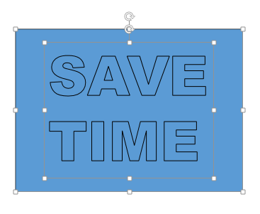
Choose Fragment from Merge Shapes drop down.
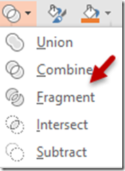
Everything will turn black and white. Don’t worry.
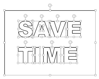
Click outside somewhere to unselect all items. Click on the outer rectangle and move it away. Click on any letter… see what happened!

The rectangle is now hollow where the text was (like a stencil) and individual characters are separate shapes. Best of both worlds! Now decide what do you want to play with – characters or the stencil.
Because you are learning, cut the stencil and paste it into a new blank slide. So that you can play with either of them.
Remember, that both are shapes. Suppose I fill both of them with some color … this is what happens.

Notice the small triangle inside A. This guy got left out. It is still a separate component, but it did not get selected with the outer rectangle. This will happen for all closed spaces. So what should you do? Carefully select the rectangle and such isolated elements, group them and then move them out.
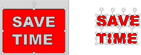
Create a copy of both the stencil slide and the individual letters slide so that we can use them later.
See what happened to the letters
Right Click on any letter and choose Edit Points. You can reshape it anyway you want. Yes. Requires practice. But imagine the possibilities!

What can be done with images (photos)?
Let us work with the the individual text characters and a picture. I have added a picture of showing two clocks. Nice way to show 9 to 5 work time. The original text is put on top of the image- notice that this is the textbox – not the fragmented shapes.

Make a copy of this slide before we do any merge operation. This way, the original state is preserved in case something goes wrong while merging.
Now choose the image first and then the text. Choose Fragment.
As expected the image behaved like the simple rectangle in the example above. We have multiple objects – including each character and the closed triangle of A.
The important thing to notice is that all the resulting objects are still PICTURES.
They are not shapes. Always notice whether you see Picture Tools or Drawing Tools menu when you click on an object. (If you have a shape which is filled with a picture, you will see both tabs)


Now if you try subtract (select image first and then text) see what happens.
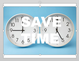
Image remains without the text. And if you choose Intersect, only the text remains. Therefore, fragment is a combination of intersect and subtract.
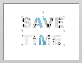
Let us complete the story with a nice animation – to illustrate how the merge shapes feature can be exploited to generate high impact.
Save time animation
I added a savings piggy and used some animation to make the letters go into the bank!
High impact with minimal effort!
Play this presentation to see the final result. Click the arrows to change slides. See it full screen for better impact.
You can also download the presentation by clicking on the menu at the bottom…
What next?
I am sure you want to know how the animation was done. We will discuss that in detail in the next few posts.
***


2 Responses
For spreadsheet table image, how to merge fragments made from each column (cropped to narrow width)?. Goal is to reduce table width (original for computer monitor view) for printing. Thanks Ahead!
Which image area you talking about? There is no spreadsheet image in this post.