We get lot of data and reports every day. Usually, to understand the information easily, we draw charts. Nothing wrong with that. Except that there are other methods available which may be more effective. Here is one such method which divides the data into three categories – high, medium and low.
Let us see how to do this. You must have Office 2007 or above for this to work.
Which version of Office do I have?
Contents
Example
Let us take some sample data to illustrate this useful technique.
If we draw a regular line chart of this data, it will look like this:
This is ok, but confusing. What we are interested in checking is when was the sales high, medium or low. The chart does provide that information but not in a manner which is easy to understand.
Show additional information inside the data
This is a new way of thinking. In the chart above, the data is separate and the chart is separate. Now it is possible to add the visual information to the original data itself.
Here are the steps:
Step One: Select the data
Step Two: Apply special formatting
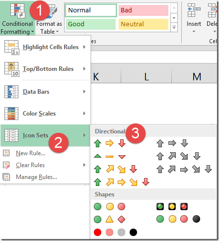
Open Home tab – Conditional Formatting – Icon Sets – choose this one…
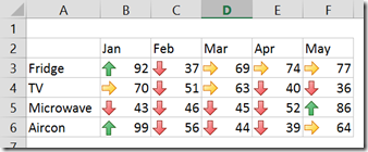
We chose three arrows option under Icon Sets. What happens?
The data is visually divided into three categories – with each type of arrow shown.
High values get , Medium values get
, and low values get
arrow.
How did Excel decide the color coding?
We just chose the option. Excel automatically figured out which cell gets which type of arrow. Here is how…
Firstly, Excel found the minimum and maximum values for the selection – 36 and 99. Then it divided that range into three equal pieces – 0 to 33%, 34-67% and 67% or above. Each category got a different type of arrow.
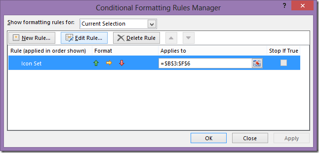
If you want to see how this happened (and edit the settings), click inside the data, open Conditional Formatting – Manage Rules.
Now the rules dialog opens. In this case we have only one rule applied. Choose the rule and click Edit Rule.
Now you can see the logic of how this was done. Yes. This dialog has too many things in it but don’t get confused. Focus on the lower part which shows the percentages used to assign the right type of arrow.
Can we show only the icons and hide the numbers?
Don’t even think of changing font color to White! Remember, the first thought which comes to your mind is usually INEFFICIENT!!!
Of course. See the checkbox Show Icon Only in the picture above? Choose that option. Now you can show the overall pattern without cluttering the display with too many numbers. This is a good option to use before copy pasting the data into PowerPoint.
Now try various options
In the next article I will discuss this option in detail. In the meantime, why don’t you try various options in the Edit Rule dialog and explore this powerful way of visualizing information.
***


