We have seen how to put data bars in Excel (Bar charts with a difference). These help us compare any value with any other value visually. This helps us understand patterns in the data.

If not used properly, this great feature can lead to confusion and misinterpretation as well. Here are common scenarios and the solutions.
Contents
Different Column Widths
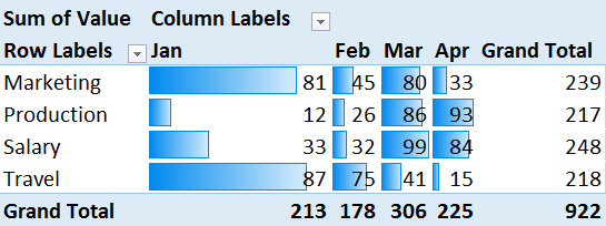
It is obvious that for proper interpretation, all columns should have the same width. However, if you have multiple columns, some widths may not be same and you may not notice it. Worse still, you may change column widths for some other data in the same column and may not realize its effect on the Data bars.

Pivot Tables in Compact Mode
This problem occurs naturally with Pivot Tables.

The solution is to adjust the width manually or change the layout to Tabular Mode (Design Tab – Report Layout)
Different Row Height
This can happen due to text wrapping in one or more cells. This also disturbs the proportions and leads to confusion. Keep the height exactly same for all rows.
Key Learning
Visual interpretation is prone to distortion. The flexibility which Excel offers can hamper the accurate interpretation of data if you are not careful.
***


