You can create this impressive effect to split text and pictures using PowerPoint 2013. This works with text as well as pictures. Find out how (Time required, 10 min).
The concept
PowerPoint 2013 provides a great set of features for shape manipulation called Merge Shapes. Using this feature, new shapes can be created or existing shapes can be split in creative ways.
Read these articles to understand the Merge Shapes feature in detail.
Show Off Demo: Create new shapes in PowerPoint
Merging Shapes – Part 2
The idea is simple. Create some text. Then create three rectangles which overlap the text. Select the text and rectangles one by one and split them using subtract feature.
The Steps
We need some text and three rectangles. Type any text. Upper case works better as all letters have the same height. Draw three rectangles. Choose No Outline. The rectangles should be broader than the text. For illustration purpose, I have chosen three different fill colors, but that is not necessary. Make the colors transparent so that you can see the text behind the rectangles when we overlap them.
Arrange the rectangle heights in such a way that the desired split can be achieved. This is better done by overlapping the rectangles on text. Now you see why transparent background is important. Readjust the height of rectangles as required. Make sure there is no gap between the rectangles.

Now, select all of them – the text and three rectangles and make three copies.
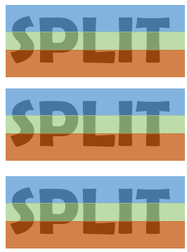
Now remove the unwanted rectangles in each copy. Top, middle and bottom.
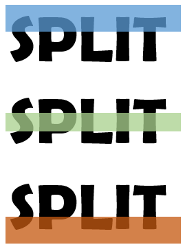
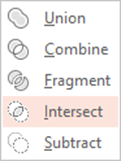
Now we are ready to do the split! Choose the textbox first, press the shift key and then click on the rectangle. This order of selection is very important. Then go to Drawing Tools and choose Intersect from the Merge Shapes menu. (Add this button to QAT as we are going to need it two more times).
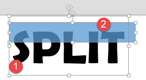
This is what Intersect means. The portion of the first object (text) which is common with the second object is kept!
Repeat the process for middle and lower half and you get three pieces of the text. Arrange them with a little gap and offset so that it looks something like this. If required, you can even animate each piece for more dramatic impact.
After arranging it, you can select all pieces, copy and paste. From paste options choose Picture. This gives you a SINGLE PICTURE with split effect (not the same as grouping).
Exactly the same process works with pictures as well. Text with Text can also be split but it requires different operations. We will cover it some other time.
Enjoy!

