Please read the first part of this article – High Impact Presentations: Using Gradient
Fun with gradients continues in this article. I will cover nuances of the gradients like direction, angle, color stops, brightness, transparency. Finally we will see how to apply all this knowledge practically using common scenarios.
Did you do the homework?
In the previous article, I had given sample gradients and asked you to reproduce them by playing with the gradient settings. Here is the actual presentation with these gradients applied.
Gradients Homework Presentation (38 kb) Download
How big is the object?
This is an important consideration while choosing the right type of gradient. A gradient which may look very impressive as a slide background may fail miserably if applied to a small shape.
Follow along
Download the presentation which contains all the gradients explained below. This way you can learn the topic much better. Remember to change settings to see the impact. This is a visual topic. You must see and learn. Not read and learn.
Gradients 2.PPTX (540 kb) Download
Direction of the gradient
Direction provides different options for different type of gradients – Linear, Radial, Rectangular and Path.
Options in the directions dropdown are fixed. But in case of Linear type of gradients, you can change the angle directly to any degree from zero to 360.
For slide backgrounds and large shapes, gradients starting from corner look better. For smaller shapes, gradients starting from sides look more effective.
Path type of gradient
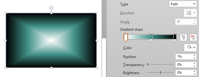
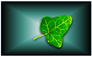
This type of effect can be created easily with three stops. Left one is white, right one is black and whatever color (darker shade) in between. Using Path type, it sparkles from the central bright white to peripheral dark. This if put behind an object or text looks really nice. There is a cushion on which the object sits.
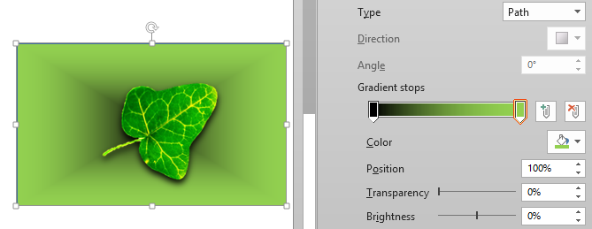
By moving the black to left and the color to right will create a hollow kind of box effect.
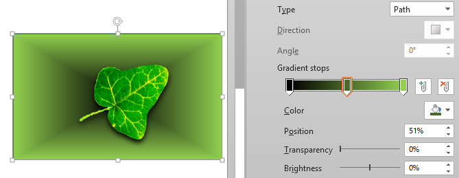
However, this hollowness or depth is not fully seen as the black area is too small. The solution is to add one more stop in the middle – just click in the middle. Unfortunately, it has no impact whatsoever because where we clicked the stop picked up whatever color was underneath it. So the gradient did not change at all.
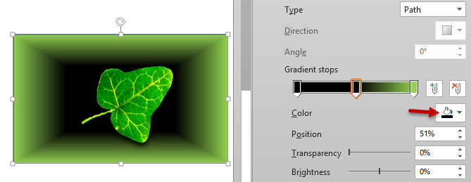
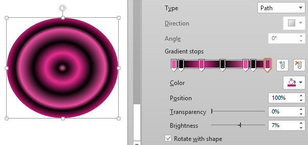
The solution is to change the middle one also to black so that the overall black area increases significantly, giving us a sense of depth.
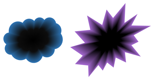
Path gradient looks even better with irregularly shaped objects…
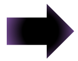
A note of warning. Path gradients do not work as expected on all shapes. For example, considering how the cloud gradient worked, if you apply the same gradient to this arrow, it does not work. I have not figured out which shapes work with path gradients and which ones do not. If I find it, I will update this post.
Using Transparency – with another object
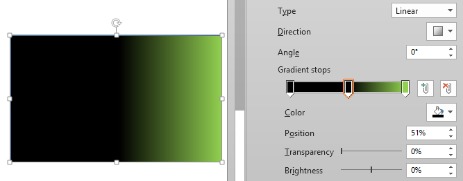
I feel the most powerful part of gradients is that we can make the color stops transparent – fully or partially. To illustrate this, I have a simple linear gradient with all three black stops. This time the leaf is behind the rectangle. Right now you cannot see the leaf because all the three color stops are opaque.
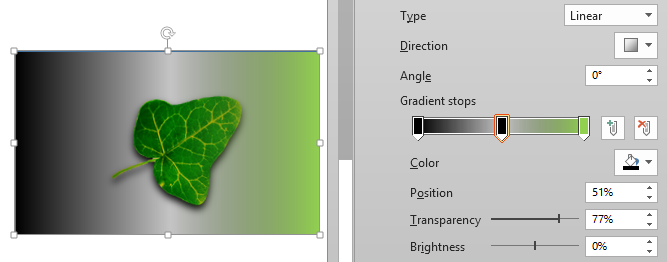
Now let us increase the transparency of the middle stop to 100% and see what happens.
Because of the transparency, the leaf is visible. The rest of the area (other than the leaf) is just the white background of the slide. Therefore the black mixed with it to create shades of gray on the left side and lighter shades of green on the right side.
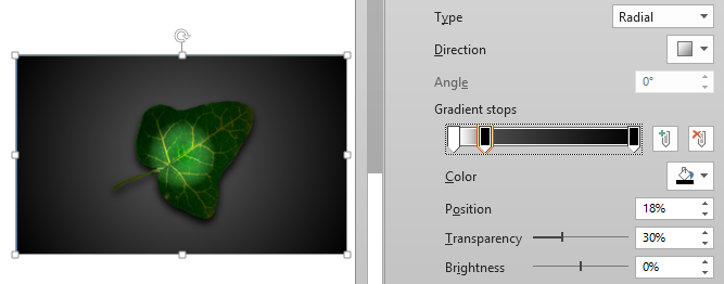
Changing this effect to radial and with little tweaking, you can get a very nice effect. Left white stop is fully transparent. Middle black stop is 30% and rightmost black is zero percent transparent.
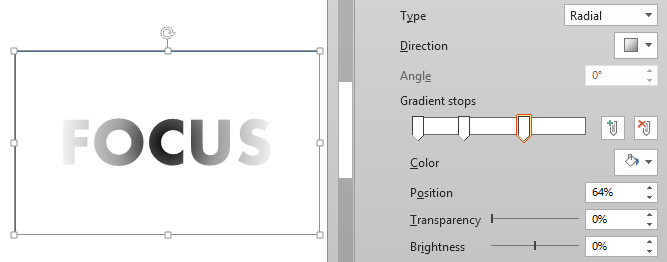
In this example, an interesting text effect is achieved by using three stops. This is the radial effect therefore the leftmost stop is in the center. The left stop is fully transparent, the middle one is 38% transparent and rightmost is zero percent transparent.
Of course, similar effect could have been achieved by adding similar black gradient to the text itself.
Using brightness to create 3D effects
Changing the brightness changes the color itself in practical terms. Increasing the brightness can make the colors jarring. It usually leads to reduction of visual depth.
Decreasing the brightness increases the darkness – which increases the sense of depth and mystique.
Metallic effects using brightness
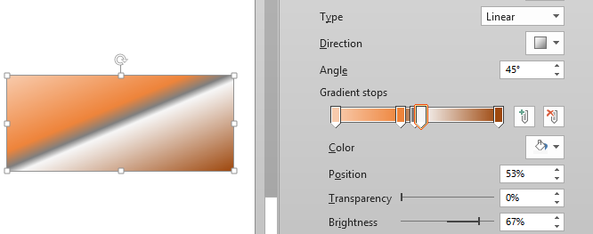
This is another usage of the brightness feature. If you add a bright different colored gradient stop, things look shiny and metallic.
Using Gradients with Text
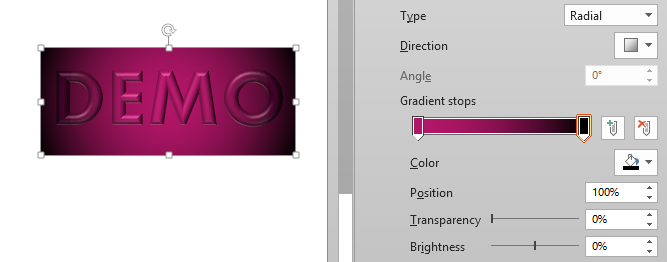
While gradients applied to shapes and backgrounds are subtle, Text gradients are usually applied for stunning impact. Usually the text is also 3D to have a better rendering of the gradient.
In this case, the exact same gradient is applied to the text as well as the box around it. Text has been made a little 3D to make it stand out. This produces a very nice look very with very minimal effort.
Gradients with pictures
Yes. Gradient can be applied to pictures as well. The question is – where is the gradient going to be visible in a picture? Good question!
Pictures can have some transparent areas. Gradients can be applied to these areas.
This is a beautiful Thai wood carving. The left picture is the original one. The right one has its background removed and a two color gradient applied. (Artificial Intelligence at work: Remove Background)
Slide backgrounds
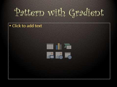
This is a common use of gradients. Applying the gradient along with a pattern and transparency can give you many interesting effects.
To get this type of effect, go to slide master and fill the background with a pattern. Add a rectangle which completely overlaps the background. Send to Back so that it does not interfere with the textboxes and then play with gradients to get the desired effect.
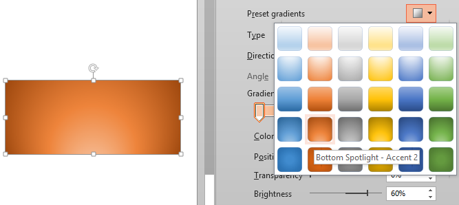
Presets are special
Some effects can only be achieved through presets. For example this one.
The top and bottom spotlight gradients can only be created using the presets. These are radial gradients. But in case of radial gradients the direction can be either of the four corners or the center. But in this case the center of the effect is in the bottom of the shape. This is not available through any other menus.
Gradients in practice
Remember that gradients can be applied to lines, shapes, charts, SmartArt and slide backgrounds. Use them with finesse and discretion. Do not overdo the effects.
It is better to be subtle than gaudy.
One warning. There are lot of colors and shades within gradients. Each projector may render them differently depending upon many factors. The brightness of the projector matters. Do NOT increase the brightness or contrast to full. That will kill all gradients. Test your slides on the target projector beforehand to avoid on-stage mishaps.
—

![image_thumb[61] gradient direction](https://5ecacaf0.delivery.rocketcdn.me/wp-content/uploads/2014/05/image_thumb61_thumb.png)
![image_thumb[19] image_thumb[19]](https://5ecacaf0.delivery.rocketcdn.me/wp-content/uploads/2014/05/image_thumb19_thumb.png)
