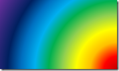
Gradient is a smooth transition from one color to another color. It is a simple concept. Rarely used properly, but misused often. The technology is simple, but effective usage is not.
Let us explore why we should use gradients and how to use them with finesse. This article is for Office versions 2010 and above. The concepts shown here work across all Office tools.
Contents
Quick Concepts – Gradient and Gradient types
In the picture above you see three gradients – which look like three colored blades. Each blade starts with a color and slowly merges into black. The smooth merging is created by using intermediate colors. At the edge of each blade, the color changed to black abruptly providing visual discontinuity and separation between the blades.
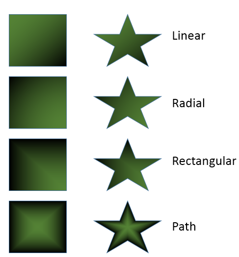
It comes in many types and it looks different depending upon the kind of shape you have. In this example, it is a gradient based upon two colors – green and black. There are four ways of spreading the colors to fill the shape.
Notice that the type of gradient which looks good for a regular shape (square), does not look good on an irregular shape like the star below.
Create a shape. Choose Drawing tools and choose the Shape Fill Dropdown…
More Gradients… option gives you full control over the details.
Another method to open this pane is to right click on any shape and choose Format Shape.
This area looks very confusing and inundating. But it is not. I will show you how to use it.
Choose Gradient Fill
The first step is to choose Gradient fill. Only then will you get all these options. Depending upon the object selected, some other fill option may be selected initially.
Now you have to choose at least two colors and decide which type of gradient and which variation will be useful. Everything else you see there is for tweaking the exact look and feel of the gradient.
The last checkbox – Rotate with shape decides whether the gradient should rotate if the shape is rotated. Leave it ON by default.
Presets
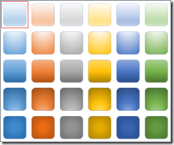
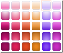
Initially you can start with presets. In earlier days we have many different types of presets – some of which were genuinely grotesque. Now we get subdued and simple variations of the primary accent colors as per the current design theme.
The left side is Office theme and right side is Ion Boardroom theme.
Notice that each of these is a collection of variations we saw earlier. Using one of these is the easiest method of getting a gradient without any additional manual work. The top left gradient in the screenshot on the left is the default gradient applied if you use the Office design theme.
Where can it be applied?
Gradients can be applied to any shape, line or font. That sounds obvious. But that is not all. Remember that the entire slide background is also a rectangular shape. Every item in a chart is also a shape and every item in a SmartArt is also a shape. And yes, gradients work with pictures as well.
Now the possibilities suddenly explode. Learn the core feature first and then apply it intelligently to specific areas of your documents or presentations to create high impact with minimal effort.
How to create it?
There has to be a start color and a stop color. But that is not all. Office allows you to use up to 10 such colors giving you lot of flexibility. That does NOT mean you use 10 color gradients. Here is a 10 color gradient which is offensive rather than attractive.
Usually subtle gradients are more attractive and useful compared to gaudy and stark gradients.
When you start a gradient, you get the previous gradient used or you get the default one.
Each color is called a stop. If you want to add a new stop, click in an empty area on the bar.
Here is how it happens… Restart PowerPoint, Create a new blank presentation using the default Office theme, add a box and choose Fill as Gradient. The top left gradient in the Presets is applied (shown in the screenshot above with a red border around it)
Notice that the gradient type is Linear. To see or change the direction you have to open the Direction dropdown. The items in the dropdown are only good for initial selection. When you open it again, it does not show the currently selected direction. This is because, many settings can change the starting direction.
The Angle is at 90%. Angle can be changed only for Linear type of gradients. Other gradients do not require an angle because their orientation is implicit. (Don’t worry about it right now. You will understand it later).
Notice that there are four gradient stops. I have labeled them with numbers. The left one is white and other three are light blue.
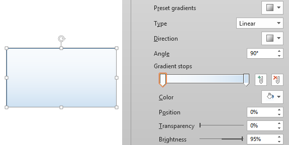
For learning purpose we want only two stops. So click on the Stop labeled as number 2 and press delete or click the delete button on the right side. Do the same thing for the Stop labeled as 3. Now the gradient will look like this.
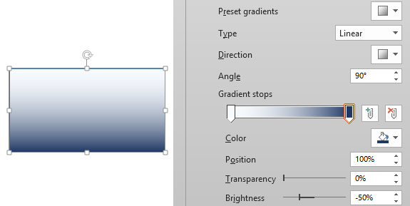
Just to get an idea of how to tweak these settings, let us change the light blue to a darker shade of blue. To do so, click on the second (rightmost) stop handle and open the color dropdown to choose dark blue color.
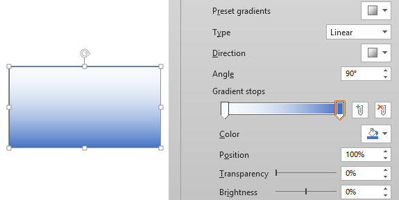
Note that the second stop is currently selected and it is shown as 100% Position. The entire ramp is from zero to hundred. There is no transparency and the brightness is negative 50%. Now I will change the brightness to zero % to see what happens.
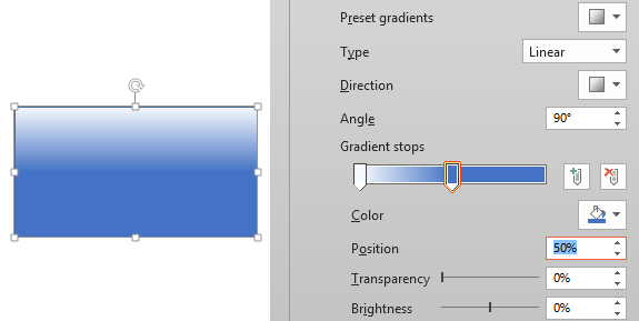
The blue color became lighter. Now, move the second stop to a Position of 50%. This way, we are not specifying which color should occupy the 100% (rightmost) spot.
Observe and understand how the gradient changed. From 50% to 100% the same color is used because we did not specify any other color yet.
Now I will add a third stop at 100% position manually. How to do that? Just click at the rightmost area and drag it to 100% position. I will also change that color to black.
I am sure you are now getting the idea of how these settings work.
Homework
This is already becoming a very long post and there is lot more to cover. So let me give you some homework so that you can play with these settings. Try to reproduce the following type of Gradients. In the next article, I will provide the same presentation for download so that you can check your output with what I did.
I have put a black background so that the gradients stand out. The gradients themselves contain black areas. Therefore, to demarcate them visually, I have put a white border around each shape.
Next Article
In the next article we will discuss further nuances of creating gradients. This includes changing the direction, angle, color stops, brightness. We will also see how to use transparency to create some interesting and useful visuals instantly. In addition, we will see the practical application of these concepts with Text, Charts, SmartArt and Pictures. Finally we will also see how to create nice slide backgrounds.
Your inputs are valuable
As you know, I am not a graphic designer. Many of you have that expertise. Feel free to post additional thoughts, suggestions and anything else which can improve the content. While writing these articles, I also learn as much as you do. Cheers!


