In an earlier post, I explained how to convert a Word document to a PowerPoint presentation in one click (ok… few clicks!). Unfortunately, the resulting presentation is guaranteed to put your audience to sleep. The presentation contains only text. And lots of bullets. Everyone in the world knows that …
 Most presentations are boring! Still we contribute to that boredom by creating more boring presentations. If you want to succeed in your presentations, you should strive to be in the 1%
  There are thousands of ways to make your presentation less sleep inducing. But one method stands out. Which is quick and easy.
SmartArt.
Convert those boring bullets into interesting and easy-to-understand diagrams.
Boredom to excitement… in few clicks
- Right click in your bulleted text and choose Convert to SmartArt.
- PowerPoint shows you 20 diagrams to choose from.
- Move the mouse cursor over each diagram – it is temporarily drawn … move to next till you find the most suitable diagram to explain your concept.
- Remember that most people don’t do this. So you are already in the 5%
- But you don’t want to stop there. You want to be exclusive…
- So have the courage of clicking on More SmartArt Graphics… (nobody has that courage… so that is your competitive advantage)
- Now you will have a big problem
135 diagrams to choose from!
Don’t get disheartened. In a given business context, only one or two of these diagrams are most suited. The real skill is finding the right diagram for your need. Unfortunately, there is no easy way there. You have to put effort.
Homework: Learn 135 diagrams
Spend 30 minutes of your precious life to do this:
- Create a new blank presentation
- Create a new slide (usually it will be Title and Text type of slide)
- Open Insert tab and choose SmartArt
- Look at the categories on the left. These will tell you overall categories of diagrams from a business point of view.
- Click on each category. Then diagrams of that category are shown.
- Now click on each diagram.
- On the right side, a bigger version of that diagram is shown. Just imbibe that visually.
- Look below… Microsoft has taken the trouble to explain the business context in which the diagram should be used. Read that.
- Move to the next diagram.
Spend 
Contents
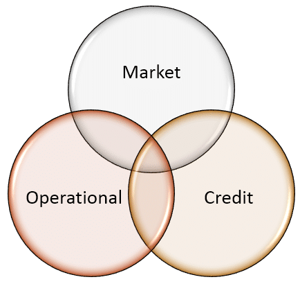
Risk Management
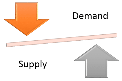
Pricing is determined by demand and supply
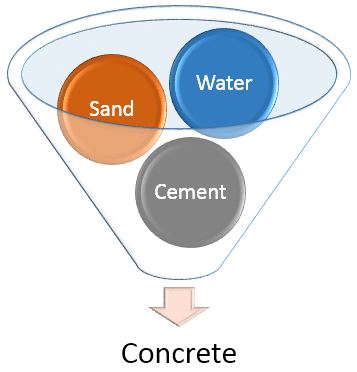
Input and Output
Colors, Styles, Animation and Effect options
Try all options on the SmartArt Tabs – Design and Formatting to know more about what you can do. Also apply some simple animation and choose Effect options to see interesting ways in which you can control the animation.
How to get full control?
SmartArt is very nice. But you have one limitation. You cannot change one item independent of others, you cannot group items and so on. Don’t worry. Use SmartArt first to create a base diagram quickly. Then click Design tab and Choose Convert to Shapes. Now it is no longer a SmartArt diagram. It becomes a simple diagram with grouped objects and shapes. Now you can ungroup it and control each shape exactly the way you want. Now you get best of both worlds. Quick diagram and full control.
Homework 2
Take any of your existing presentations. Save it as a copy. Look at existing verbose slides and see if you can improve them using appropriate usage of SmartArt
Pending issue
Creating Picture SmartArt is not easy. You insert the SmartArt first and then you have to choose one picture at a time, repeatedly. And as you know, repetition means inefficiency. In the next post we will see how to create SmartArt containing many pictures (of dissimilar sizes) in two simple steps. Another miracle coming up…


