
Ask Power BI – Natural Language Q&A
Ask a question to Power BI and it will generate the visual or chart for you instantly. Never say “I will get back to you”. Take faster and informed decisions.
Ask a question to Power BI and it will generate the visual or chart for you instantly. Never say “I will get back to you”. Take faster and informed decisions.
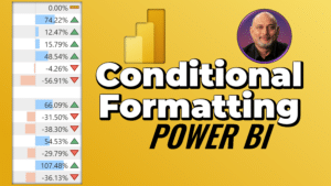
Use Conditional Formatting and Sparklines in Power BI to make it easier to understand reports. Use data bars, icons, colours and more. Create amazing Power BI dashboard. Download sample files
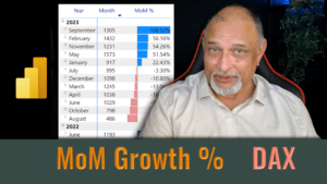
Learn how to use Power BI DAX to calculate mom growth or decline using a measure Analytics. We will use the PREVIOUSMONTH function to create a measure for comparison. Download

Create a visually appealing list of products, services, parts, people, videos, documents and more … use the Power BI visual – Card Browser. Also learn about the new Slicer visual.

Elevate your data storytelling – Use Timeline Storytelling visual by Microsoft in Power BI. Create story elements, present as a sequence. Interact visually. Convert boring data into insightful and interesting
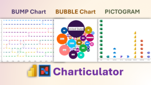
Charticular is a versatile #powerbi visual. We will learn how to create three types of charts – bump, bubble and pictogram. Download sample file and follow along Contents Related videos
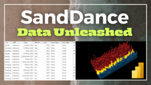
Power BI has a powerful custom visual from Microsoft called Sand Dance It is a UNIT visualization – which means – every row of your data is presented in every

Power BI has a large collection of visuals. Using the right visual is important. In this video we will learn nine best practices about using visuals the right way. Using
Power BI is popular. Use these 10 best practices to make useful, insightful and flexible reports. Avoid common mistakes and make it easier for yourself and others to understand the


